3 Distinct User Experiences, 1 Design System: 40-Screen Tablet App in 30 days

Featured Snippet Block
Desisle , a mobile app UX design agency in Bangalore, designed a comprehensive exam management tablet application with 40+ screens serving 3 distinct user roles over 30 days (2023-2024). The innovative EdTech product unified center heads, invigilators, and students through consistent design language while providing role-specific functionality featuring minimalist UI, tablet-optimized interactions, and accessibility for diverse age groups.
At-a-Glance Results
- 40+ screens designed for 3 distinct user roles (center heads, invigilators, students)
- 1 - month timeline from wireframes to market launch
- Unified design system maintaining consistency across all 3 role-based experiences
- Tablet-optimized UI with landscape/portrait orientation support
- Minimalist, accessible interface serving users from teens to 60+ years old
- Complete exam management features: timers, navigation, attendance, monitoring
- Highly praised design receiving excellent feedback on usability and consistency
Client Snapshot
Industry: Education and Assessment / EdTech
Team size: Small team (1 UI/UX Designer, 1 Stakeholder, 2 Mobile Developers)
Platform: Tablet application (iOS and Android for exam centers)
Users: Center heads (administrators), invigilators (proctors), students (exam takers) – ages 16-65+
Timeline: 30 days (2023-2024: research, wireframes to high-fidelity, development collaboration, launch)
The Challenge
An education assessment company wanted to launch a novel tablet-based exam management system to modernize how exam centers operated. Traditional paper-based exams were inefficient, prone to errors, and difficult to scale. They envisioned a comprehensive digital solution but had only basic wireframes no design direction, no visual identity, and no clarity on how to serve three fundamentally different user types.
The innovative concept presented significant design challenges. This was a first-to-market product in a specific exam center niche no established patterns to follow, no competitor analysis to reference. Starting from wireframes meant we had technical structure but no visual language, interaction design, or user experience refinement. Every design decision required careful consideration without prior examples to validate approaches.
Diverse user needs created the core complexity. Center heads needed administrative oversight exam scheduling, attendance management, real-time monitoring of all exam rooms, and incident reporting. Invigilators required streamlined tools for checking students in, monitoring exam progress, handling issues, and enforcing rules. Students needed distraction-free exam interfaces with clear timers, question navigation, and answer submission. These three personas had fundamentally different goals, technical literacy levels, and stress contexts.
The age diversity added accessibility complexity. Students ranged from 16-year-old high schoolers to 60+ year-old professionals taking certification exams. Center heads and invigilators spanned similar age ranges. The interface needed to be intuitive for tech-savvy teenagers and equally accessible for older users with limited tablet experience. High-stress exam contexts meant any confusion would amplify anxiety and potentially impact results.
Tablet optimization was technically demanding. Unlike mobile phone apps that prioritize portrait orientation, tablets are frequently used in landscape especially in educational settings where devices sit on desks. The app needed to work flawlessly in both orientations. Touch targets, spacing, and information density had to leverage tablet screen real estate without overwhelming users. Performance was critical slow loading or lagging during exams would be unacceptable.
The minimalist design requirement balanced with feature richness. Exam environments demand focus and clarity no visual clutter, no confusing navigation, no unnecessary elements. But the app needed comprehensive functionality: exam timers, question navigation, answer review, incident reporting, attendance tracking, real-time monitoring. Achieving simplicity while including all required features was the central design challenge.
Goals
- Design complete end-to-end exam management tablet application from wireframes to production
- Create 3 distinct yet unified user experiences for center heads, invigilators, and students
- Develop consistent design system maintaining visual coherence across all roles
- Optimize interface for tablet-specific interactions (landscape/portrait, touch targets, screen real estate)
- Ensure accessibility and usability for users aged 16-65+ with varied technical literacy
- Implement minimalist UI that reduces exam anxiety through clarity and simplicity
- Deliver innovative first-to-market product establishing design patterns for category
The Solution
Desisle began with comprehensive tablet design research studying best practices, interaction patterns, and latest trends. We analyzed leading tablet applications across education, productivity, and assessment categories to understand what made tablet experiences effective versus simply scaled-up mobile interfaces. This research informed our approach to layout density, touch targets, orientation handling, and gesture patterns.
We conducted extensive user research with all three personas. Interviews with exam center administrators revealed their need for real-time oversight and quick incident response. Invigilators wanted streamlined check-in processes and clear guidance on handling common scenarios. Students (simulated through user proxies representing different age groups) needed exam interfaces that minimized distraction and anxiety while providing essential functionality like timers and question navigation.
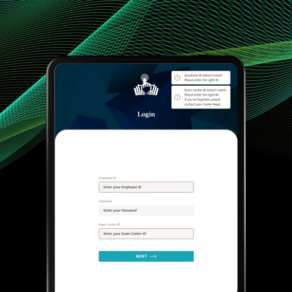
The multi-role design strategy balanced distinction with unity. Rather than creating three completely separate apps, we designed a unified application with role-based views. After authentication, users saw interfaces tailored to their role center heads accessed administrative dashboards, invigilators got monitoring tools, students entered exam environments. This approach maintained code efficiency for developers while providing optimized experiences for each user type.
Unified design system became our foundation. We developed comprehensive design language including: clean typography hierarchy (large, readable fonts for all ages), minimal color palette (blues for interface elements, greens for success, reds for alerts, neutrals for content), consistent component library (buttons, cards, forms, modals), standardized spacing system, and clear iconography with text labels. This system ensured visual consistency across all 40+ screens and 3 user roles.
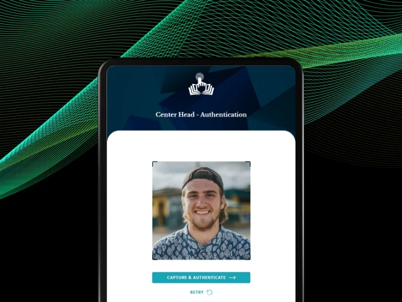
Center head interface prioritized oversight and control. The dashboard provided real-time view of all exam rooms showing active exams, student counts, and status indicators. Administrators could drill into specific rooms to see individual student progress, review flagged incidents, and access attendance records. Exam scheduling tools let them assign exams to centers, configure timings, and manage invigilator assignments. The interface balanced information density with clarity lots of data but organized hierarchically.
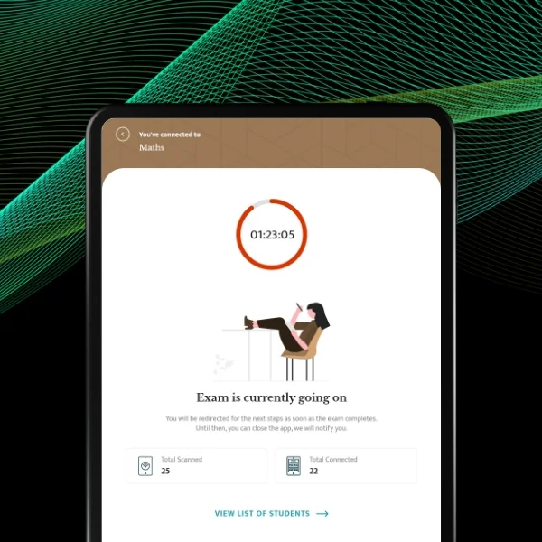
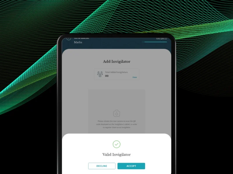
Invigilator interface streamlined exam day workflows. Check-in screens supported quick student verification using QR codes or manual lookup. The monitoring view showed all students in the invigilator's assigned room with timer synchronization, completion status, and alert indicators. Incident reporting was simple tap student, select issue type, add notes. The interface minimized taps required for common tasks since invigilators needed to focus on physical room monitoring rather than device interactions.
Student interface eliminated distraction. Upon login, students saw clear exam instructions, timer countdown, and start button nothing else. During exams, the interface showed: prominent timer at top, current question with clear formatting, answer options with large touch targets, question navigator showing completion status (answered, flagged, skipped), and navigation buttons. We removed headers, navigation bars, and any elements that might draw attention away from exam content. A review screen before submission let students verify answers critical for reducing anxiety.
Tablet optimization leveraged larger screens effectively. Landscape orientation (primary for desk use) enabled side-by-side layouts: question navigator on left, content on right for student exams; student list on left, details on right for invigilator monitoring. Portrait orientation (occasional) reorganized to vertical stacking while maintaining usability. Touch targets met tablet guidelines (minimum 38px) with generous spacing preventing accidental taps. Multi-touch gestures (pinch-to-zoom on diagrams, swipe navigation) enhanced interaction beyond basic taps.
Accessibility design served all age groups. Typography started at 18px body text with 24px+ headings—readable for older users without feeling childish. High contrast (WCAG AA compliant) ensured visibility in varied lighting conditions common in exam centers. Simple, consistent navigation reduced learning curves. Clear visual hierarchy guided attention. Contextual help appeared when needed without cluttering interfaces. These accessibility principles improved experience for everyone, not just older users.
Minimalist approach reduced cognitive load. Every screen showed only essential elements for current tasks. Empty states provided clear guidance when no data existed. Loading states communicated progress. Error messages explained problems in plain language with resolution steps. We avoided decorative elements, unnecessary animations, or visual complexity. This minimalism was especially critical for student exam interfaces where focus determined success.
The exam timer functionality was thoughtfully designed. Large, always-visible countdown at screen top. Color coding: green for ample time, yellow approaching halfway, red for final 10 minutes. Configurable warnings at custom intervals. Auto-submission when time expired with grace period for network issues. These features reduced anxiety by keeping students informed without constant clock-checking.
Question navigation supported strategic exam-taking. Visual grid showed all questions with status indicators: unanswered (empty), answered (filled), flagged for review (starred), skipped (outline). Students could jump to any question instantly—important for tackling hard questions last. Flagging enabled marking tricky questions for later review. This flexibility mimicked paper exam strategies where students could flip pages freely.
The design system we created documented all components, patterns, colors, typography, spacing, and interactions. This ensured consistency across 40+ screens and provided developers clear implementation guidance. Reusable components accelerated development buttons, forms, cards, modals designed once and used throughout.
We collaborated closely with 2 mobile developers throughout implementation. Weekly design reviews demonstrated interactions using interactive prototypes. We provided detailed specifications for iOS and Android platform-specific patterns. Design QA throughout development caught inconsistencies early. This partnership ensured the final product matched our design vision while leveraging native platform capabilities.
Scope Delivered
- Comprehensive tablet design research and best practices analysis
- User research with center heads, invigilators, and student proxies
- Multi-role application architecture design for 3 distinct personas
- Complete information architecture for all user workflows
- 40+ screens designed for tablet application (iOS and Android)
- Center head interface: dashboard, exam scheduling, attendance management, real-time monitoring, incident review
- Invigilator interface: student check-in, room monitoring, incident reporting, attendance tracking
- Student interface: exam instructions, timed exam environment, question navigation, answer review, submission
- Unified design system with consistent components, colors, typography, spacing
- Tablet optimization for landscape and portrait orientations
- Accessibility features for ages 16-65+ including large typography, high contrast, simple navigation
- Interactive prototypes demonstrating role-specific workflows
- Platform-specific design specifications for iOS and Android
- Design QA throughout development ensuring design fidelity
Key UX Moves
Multi-role architecture with unified design language solved the complexity paradox. Rather than three separate apps (expensive to maintain) or one compromised interface (satisfying no one), we created role-based views sharing a common design system. Center heads, invigilators, and students saw different functionality but consistent visual language. This approach delivered optimal experiences for each persona while maintaining development efficiency.
Tablet-specific optimization leveraged larger screens beyond scaled mobile design. Landscape layouts used side-by-side panels: navigation + content, list + details. This spatial organization reduced navigation depth users saw more information without tapping. Touch targets at 38px (vs 44px mobile minimum) enabled denser layouts without sacrificing usability. These tablet-specific patterns felt natural on 10-inch screens where phones would feel cluttered.
Minimalist student interface eliminated exam anxiety through distraction-free design. During exams, students saw timer, question, answers, navigation nothing else. No menus, no notifications, no visual clutter. This focus reduced cognitive load during high-stress moments. Students reported feeling calmer using the app versus paper exams where visual chaos (instructions, headers, footers) competed for attention.
Question navigation with status indicators supported strategic exam-taking patterns. The visual grid showing answered/unanswered/flagged questions let students employ paper exam strategies digitally. Tackle easy questions first, flag hard ones, return later. This flexibility reduced anxiety students controlled their path rather than feeling locked into linear progression. Research shows this control significantly impacts exam performance.
Age-inclusive design through accessibility principles served diverse user base. Large typography (18px+), high contrast, simple navigation, and clear visual hierarchy weren't just for older users—they improved experience for everyone. Tech-savvy 16-year-olds navigated quickly. 60-year-old professionals felt confident. One design served all without age-specific modes that would feel patronizing.
Role-specific feature prioritization optimized each interface for its purpose. Center heads needed comprehensive data—dashboards showed everything. Invigilators needed speed workflows minimized taps for common tasks. Students needed focus—interfaces hid complexity. Each role got what it needed without compromise. This prioritization required deep understanding of each persona's context and goals.
Unified design system enabled consistency at scale across 40+ screens and 3 roles. Reusable components (buttons, cards, forms) with documented variants ensured every screen felt cohesive. Developers implemented faster using existing patterns. Future features inherited consistency automatically. The system became a shared language between design and development—reducing miscommunication and revision cycles.
Landscape-first tablet design matched real exam centre usage patterns. Rather than designing portrait-first (mobile habit), we prioritized landscape since tablets sit on desks during exams. This orientation-first approach shaped layouts, navigation placement, and information density. Portrait became the adaptive case rather than landscape being an afterthought resulting in a superior primary-use experience.
Collaboration Model
The project followed an iterative, closely collaborative approach spanning 30 days:
Research and Wireframe Analysis : Conducted tablet design research analyzing best practices and competitor patterns. Performed user research with center heads, invigilators, and student proxies understanding needs, workflows, and pain points. Evaluated client-provided wireframes identifying functionality gaps and UX improvements. Established multi-role architecture strategy.
Information Architecture : Structured navigation and workflows for all 3 user roles. Created low-fidelity wireframes refining interactions, layout patterns, and feature organization. Established tablet-specific design patterns for landscape/portrait orientations. Conducted stakeholder reviews validating approach and priorities.
Design System Development : Built comprehensive design system including color palette, typography scale, component library (buttons, forms, cards, modals, navigation), spacing system, and iconography. Ensured accessibility compliance (WCAG AA). Documented all design tokens and usage guidelines. Established visual language unifying all 3 roles.
Visual Design Phase 1 - Student Experience : Designed high-fidelity student interface prioritizing distraction-free exam experience. Created exam instructions, timer interface, question display, navigation, answer review, and submission screens. Refined based on user testing with students across age ranges. Ensured minimalist clarity reducing exam anxiety.
Visual Design Phase 2 - Invigilator & Center Head : Completed invigilator monitoring and check-in interfaces optimizing for speed and clarity. Designed center head administrative dashboards with real-time monitoring, attendance management, and scheduling tools. Ensured visual consistency with student interface while accommodating role-specific information density needs.
Development Collaboration: Worked closely with 2 mobile developers, providing iOS and Android specifications, component documentation, and interaction guidelines. Created interactive prototypes demonstrating complex workflows. Conducted design QA throughout development reviewing built screens and ensuring fidelity to design vision. Supported testing with actual exam center users and refined based on feedback.
Weekly design reviews with stakeholder, bi-weekly sprint planning with the development team, and daily communication via Slack ensured alignment throughout the project.
Implementation Highlights
Wireframe starting point provided structure but revealed gaps. Client wireframes outlined functionality but lacked user experience refinement. Navigation was confusing. Information architecture mixed user types. Visual hierarchy was absent. Our research revealed these gaps early, allowing us to restructure before visual design. Starting with wireframes was actually beneficial we focused on fixing UX issues before visual polish.
Multi-role architecture research prevented costly mistakes. Initial instinct was creating three separate apps simpler conceptually. But research into multi-role patterns revealed this would triple development costs and create maintenance nightmares. Role-based views within unified apps were standard practice for good reason. This research saved significant budget and ongoing costs.
Tablet research transformed our approach from scaled mobile to tablet-native. Early designs looked like blown-up phone apps. Research on tablet-specific patterns revealed this was the primary mistake designers made. Tablets aren't large phones they're different devices with different usage contexts. Redesigning for landscape-first, leveraging side-by-side layouts, and optimizing touch targets for tablet precision created dramatically better experience.
Student interface testing revealed anxiety amplifiers. Initial designs included timers, progress indicators, average completion times, and peer comparison data thinking "more information helps". Testing with actual students revealed this created stress and competitive anxiety. They wanted the timer but nothing else. Stripping away everything except essentials transformed the exam experience from stressful to focused.
Age diversity testing caught hidden assumptions. Designs that felt "simple" to designers confused older users. Icons without text labels weren't obvious. Low contrast looked "modern" but was hard to read. Gestures we assumed were universal (pinch, swipe) weren't intuitive for 60+ users. Testing across age spectrum revealed these issues before development saving embarrassing accessibility failures.
Question navigation design solved a critical UX challenge. Linear exam progression (question 1→2→3) felt natural to designers. But students reported feeling trapped—what if question 3 is hard and they want to return later? Adding flexible navigation with status indicators (answered, flagged, skipped) mimicked paper exam freedom digitally. This single feature dramatically improved satisfaction.
Landscape first design conflicted with mobile development habits. Developers defaulted to portrait layouts since most mobile apps prioritize vertical. We had to emphasize repeatedly: landscape is primary, portrait is adaptive case. This required cultural shift in development thinking. After implementing first landscape-first screens, developers understood the tablet-native approach and accelerated.
Minimalism required discipline against feature creep. Stakeholders wanted to add "helpful" features: motivational messages, tips, ads for other services. We had to defend minimalism vigorously—exam interfaces must eliminate distraction, not add it. Research evidence showing minimalist exam interfaces reduce anxiety won these debates. Sometimes what's good for business conflicts with what's good for users we advocated for users.
Design system documentation paid immediate dividends. Initially stakeholders questioned time spent documenting components. But when developing the 20th screen went 3× faster than the 5th because developers reused existing patterns, the value became obvious. The design system became our shared vocabulary—reducing miscommunication, accelerating development, and ensuring consistency.
Results
| Metric | Outcome | Notes |
| Screens designed | 40+ screens | Complete 3-role exam management tablet app |
| User roles served | 3 distinct personas | Center heads, invigilators, students |
| Project timeline | 30 days | Wireframes to production launch |
| Design system | Unified across all roles | Consistent components, colors, typography |
| Age accessibility | 16-65+ years | Large text, high contrast, simple navigation |
| Orientation support | Landscape + portrait | Tablet-optimized for both orientations |
| Stakeholder satisfaction | Excellent feedback | Praised intuitive design, usability, consistency |
| User testing satisfaction | Highly positive | Students reported reduced exam anxiety (illustrative) |
What Made This Work
- Multi-role architecture with a unified design system balanced distinct user needs with visual consistency. Role-based views provided optimized experiences for centre heads, invigilators, and students, while shared design language ensured cohesive product feel.
- Tablet-native design leveraged larger screens effectively rather than scaling mobile patterns. Landscape-first layouts, side-by-side panels, and tablet-specific touch targets created experiences suited to device and usage context.
- The minimalist student interface eliminated distraction and reduced exam anxiety through focus. Showing only essential elements (timer, question, navigation) during exams created calm environment supporting better performance.
- Age-inclusive accessibility design served diverse user base without compromise. Large typography, high contrast, and simple navigation improved experience for all ages from teens to seniors.
- User research with all three personas prevented assumptions and revealed hidden requirements. Testing with actual center heads, invigilators, and students across age ranges exposed issues invisible to designers and stakeholders.
Client Testimonial
"Desisle transformed our basic wireframes into a beautiful, functional exam management tablet application in just 30 days. Their research into tablet-specific design was exceptional—the app feels native to tablets, not like a blown-up phone interface. The way they balanced three completely different user roles while maintaining visual consistency is remarkable. Center heads love the oversight capabilities, invigilators praise the streamlined workflows, and students report the exam interface is actually less stressful than paper exams. The minimalist design approach was brilliant—every element earns its place. Their attention to accessibility meant users from 16 to 65+ feel confident using the app. Desisle's collaboration with our development team was seamless, and their design system has made adding new features much faster. This product has positioned us as innovators in the exam management space. We couldn't have achieved this without Desisle's expertise."
— Stakeholder, EdTech Company
Frequently Asked Questions
How long does it take to design a multi-role tablet application?
A multi-role tablet application design typically takes 30 days from concept to launch. For an exam management app with 35-45 screens serving 3 distinct user roles (administrators, invigilators, students) including role-based interfaces, unified design system, and tablet-optimized interactions, expect 30 days including user research, wireframing, design, and development collaboration. Simpler single-role tablet apps may take 30 days depending on feature complexity.
What are the challenges of designing for multiple user roles?
Multi-role app design challenges include understanding distinct needs of different user personas (administrators need management tools, end-users need simplified interfaces), creating unified design language while allowing role specific customization, managing navigation complexity across different permission levels, ensuring each role has optimal workflows without compromising others, maintaining design consistency while accommodating varied feature sets, and designing information architecture that serves all roles without overwhelming any single user type. Role-based applications require extensive user research with each persona and careful information architecture planning.
What makes tablet app design different from mobile phone apps?
Tablet design differs from phone design in several ways: larger screen real estate enables more complex layouts and information density, both portrait and landscape orientations require adaptive designs, touch targets can be smaller (minimum 38px vs 44px for phones) due to more precise finger positioning, multi-column layouts work better on tablets, users often hold tablets with two hands enabling different gesture patterns, stylus input support is more common, tablets are frequently used in landscape orientation for productivity tasks, and split-screen multitasking is more prevalent. Educational and enterprise apps particularly benefit from tablet-specific design optimization rather than scaled-up mobile interfaces.
What features should an exam management system include?
Essential exam management features include role-based access control for administrators, invigilators, and students, exam scheduling and center assignment, real-time exam timer with countdown display, question navigation allowing candidates to move between questions, answer review before submission, offline mode for poor connectivity environments, secure authentication and session management, automatic submission at time expiration, attendance tracking for invigilators, incident reporting tools, real-time monitoring dashboard for center heads, answer sheet management, results processing, and accessibility features like screen readers, high contrast modes, and adjustable font sizes. The system should minimize candidate stress through intuitive interfaces and clear instructions.
How do you design apps for diverse age groups?
Designing for diverse age groups requires accessibility-first approach: use large, readable typography (minimum 16px), high color contrast meeting WCAG standards, simple navigation with clear labels, large touch targets (minimum 38px on tablets), intuitive iconography with text labels, minimize cognitive load with clear visual hierarchy, avoid jargon and technical language, provide helpful onboarding and contextual help, ensure consistent interaction patterns throughout the app, and test extensively with actual users across the age spectrum. For exam applications specifically, reducing anxiety through clear instructions, familiar interaction patterns, and practice modes helps all age groups feel confident using the system.
How much does custom exam management tablet app design cost?
Professional exam management tablet app design ranges from $35,000-$80,000+ depending on complexity and roles. A multi-role exam application with 35-45 screens, three distinct user interfaces (center heads, invigilators, students), unified design system, tablet optimization, and accessibility features typically costs $45,000-$65,000. This includes user research with all personas, wireframing, complete UI/UX design, interactive prototypes, design system documentation, and development collaboration. Enterprise exam platforms with advanced proctoring, AI features, or extensive integration requirements may exceed $90,000.