
Web app
15-Day Design Sprint: Building an AI Analytics Dashboard From Concept to Prototype
( 00-01 )
ABOUT THE PROJECT
Desisle designed a complete AI-powered analytics platform for Adapt Insights in 15 days using a sprint-based UX approach. We delivered across 12 modules including forecast visualization, seasonality analysis, trend detection, and automated PPT generation - helping teams turn complex data into actionable insights.
At-a-Glance Results
Designed and prototyped in 15 days
12 core modules including AI assistant and auto-reporting
Complete design system with chart templates and components
Interactive prototype ready for development handoff
Sprint-based delivery with daily stakeholder reviews
Client Snapshot
Industry: Business Intelligence / Analytics Software
Team size: Early-stage startup, 5-8 people
Platform: Web application
Timeline: 15 days (3-week sprint)
Desisle team: 1 senior product designer
The Challenge
Adapt Insights needed to launch fast. They had a vision for an analytics platform that would help product teams make sense of demand forecasting, seasonality patterns, and inventory trends - but no design in place.
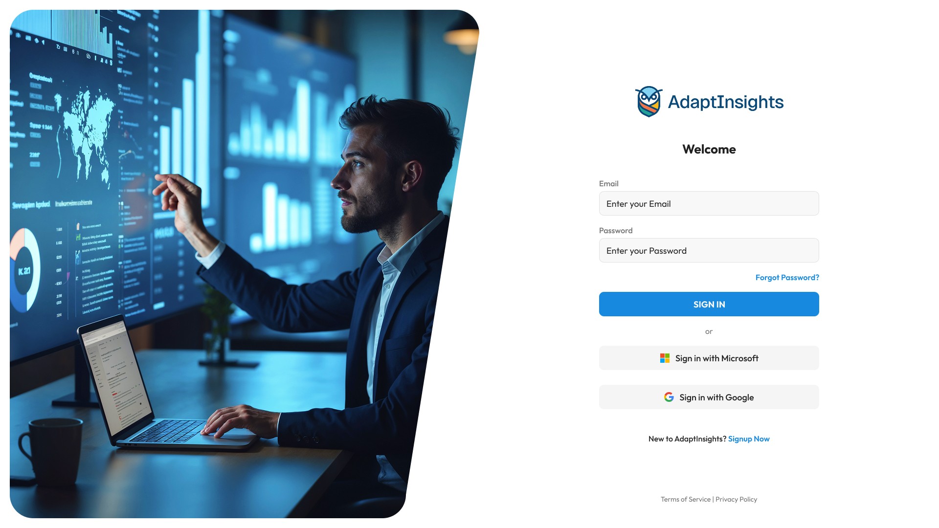
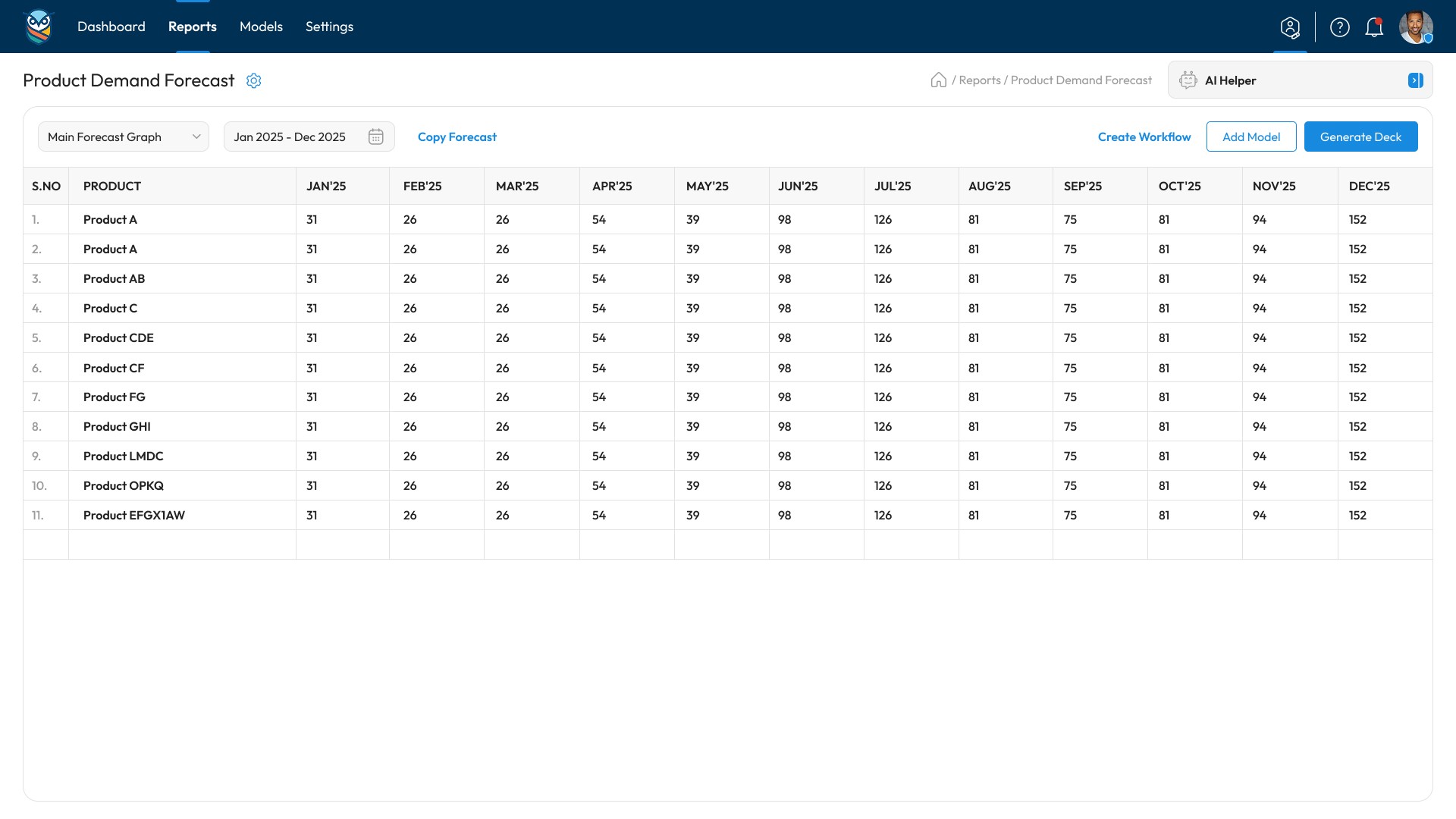
The product required heavy data visualization. Users needed to see monthly and yearly forecasts, compare product performance, spot top sellers, and identify what needs improvement. And they wanted AI built in from day one - an assistant that could generate insights, create charts, and even compile presentation slides automatically.
The constraint was tight: 15 days to go from concept to prototype. No time for lengthy research phases or multiple revision cycles. They needed a designer who could move fast without cutting corners on usability.
Goals
Design a complete analytics platform with 10+ modules in under 3 weeks
Create an AI assistant interface that feels helpful, not intrusive
Build clear data visualization patterns for forecasting and trends
Design an automated PPT generation flow that saves users hours of manual work
Deliver a working prototype developers could start building from immediately
The Solution (What Desisle Did)
We used a sprint-based approach. Instead of designing everything upfront, we broke the project into daily milestones with clear deliverables and stakeholder reviews.
Scope: across 12 modules
Core modules: Dashboard home, forecast views, seasonality analysis, trend detection, product comparison, top sellers, recommendations engine, AI assistant, PPT generator, date range customization, data export, settings
Key UX moves:
The information architecture came first. We mapped out how users would navigate between forecast views, drill into specific products, and access AI-generated insights. The hierarchy needed to support both quick scans and deep analysis.
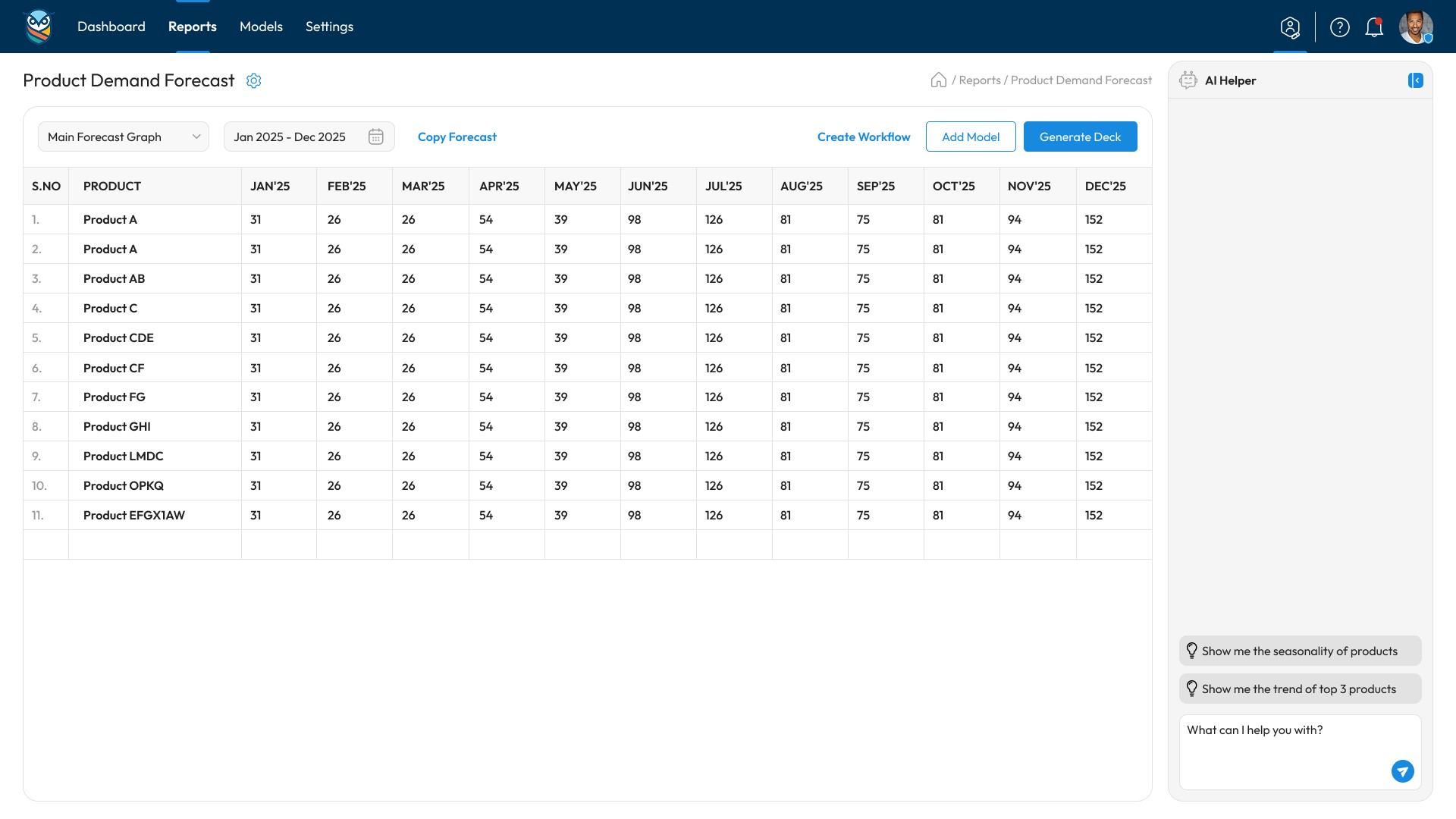
For the dashboard, we designed a metric-first layout. Key numbers up top, forecast graph center stage, and quick filters for time ranges. Users could switch between monthly and yearly views without losing context.
The design reduced cognitive load significantly. Instead of toggling between multiple tools or Excel tabs, users saw their complete product performance in one view. Color-coded indicators showed which products were trending up or down. Seasonality patterns were visible at a glance through curve visualization instead of buried in columns.
These changes shift focus from "we delivered fast" to "we delivered outcomes that matter" - faster decisions, easier comprehension, time saved, and better insights.
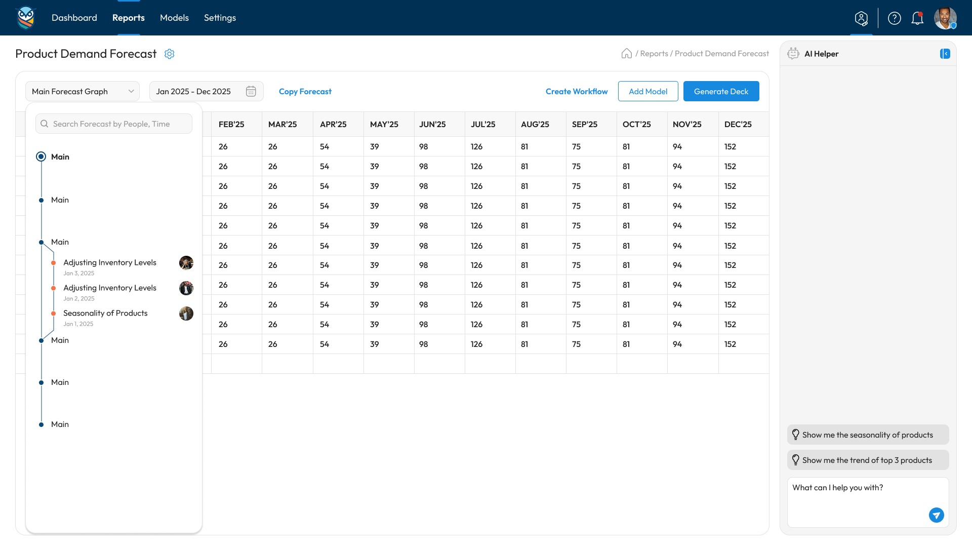
The AI assistant lived in a side panel. Users could ask questions about their data, request specific charts, or trigger the PPT generation. We designed the interface to show the AI's "thinking process"—displaying which data it was analyzing and what patterns it found.
Chart design was critical. We created templates for forecast graphs, seasonality curves, trend lines, and comparison bars. Each chart included clear labels, tooltips on hover, and export options. The visual style stayed consistent across all.
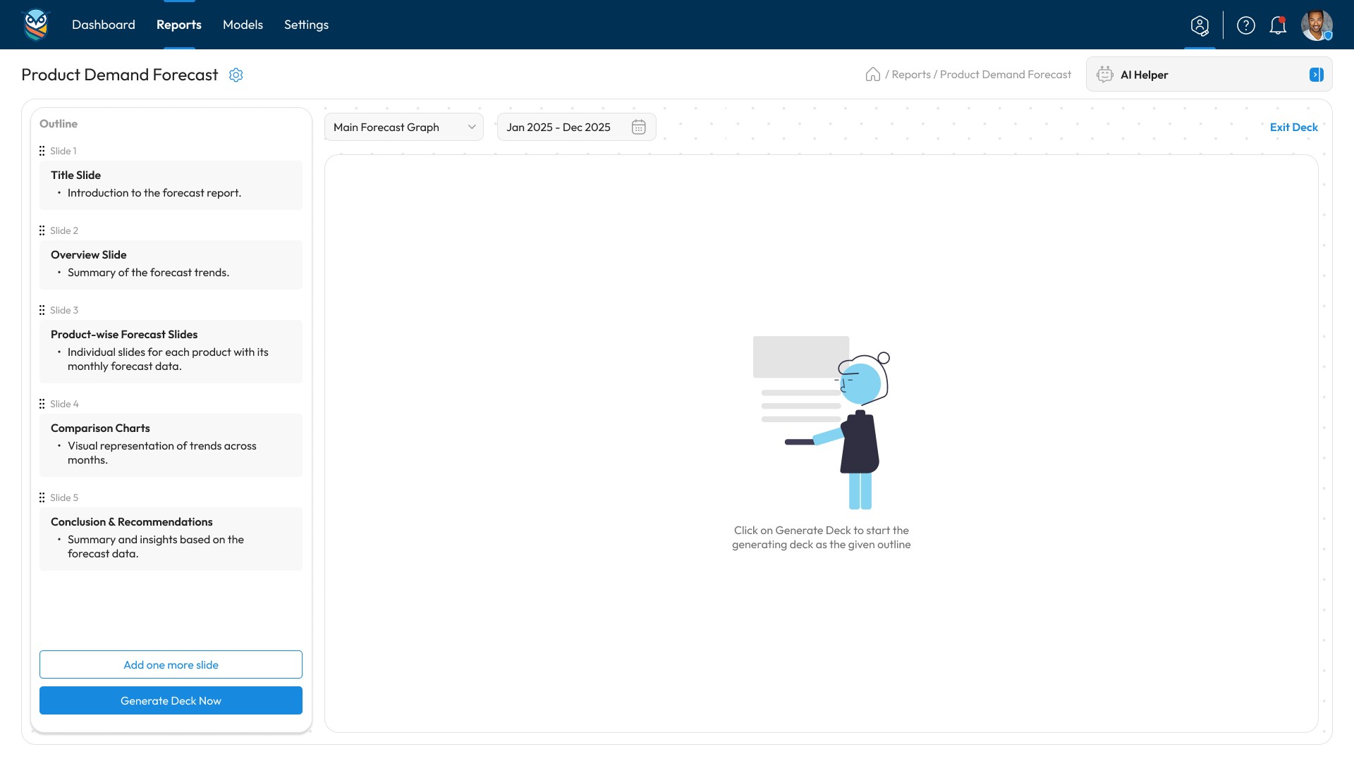
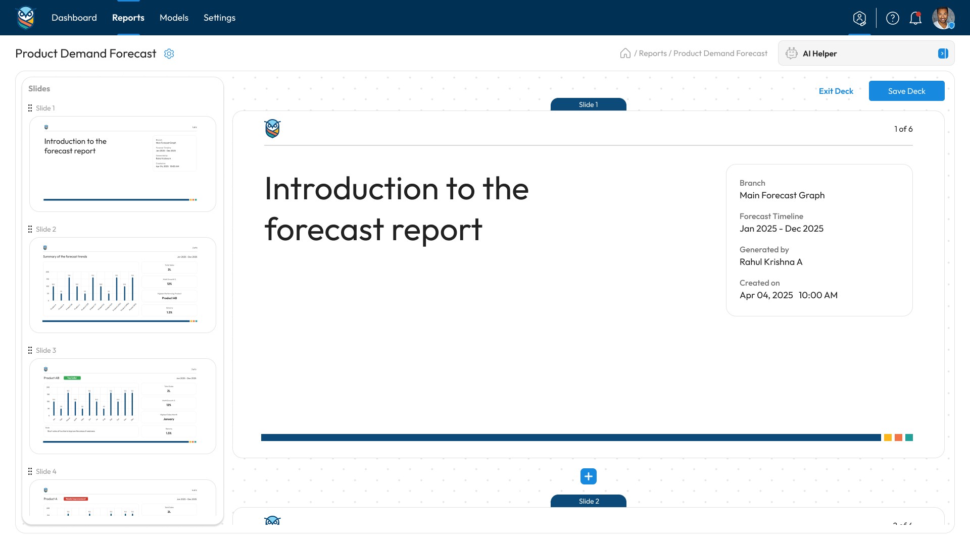
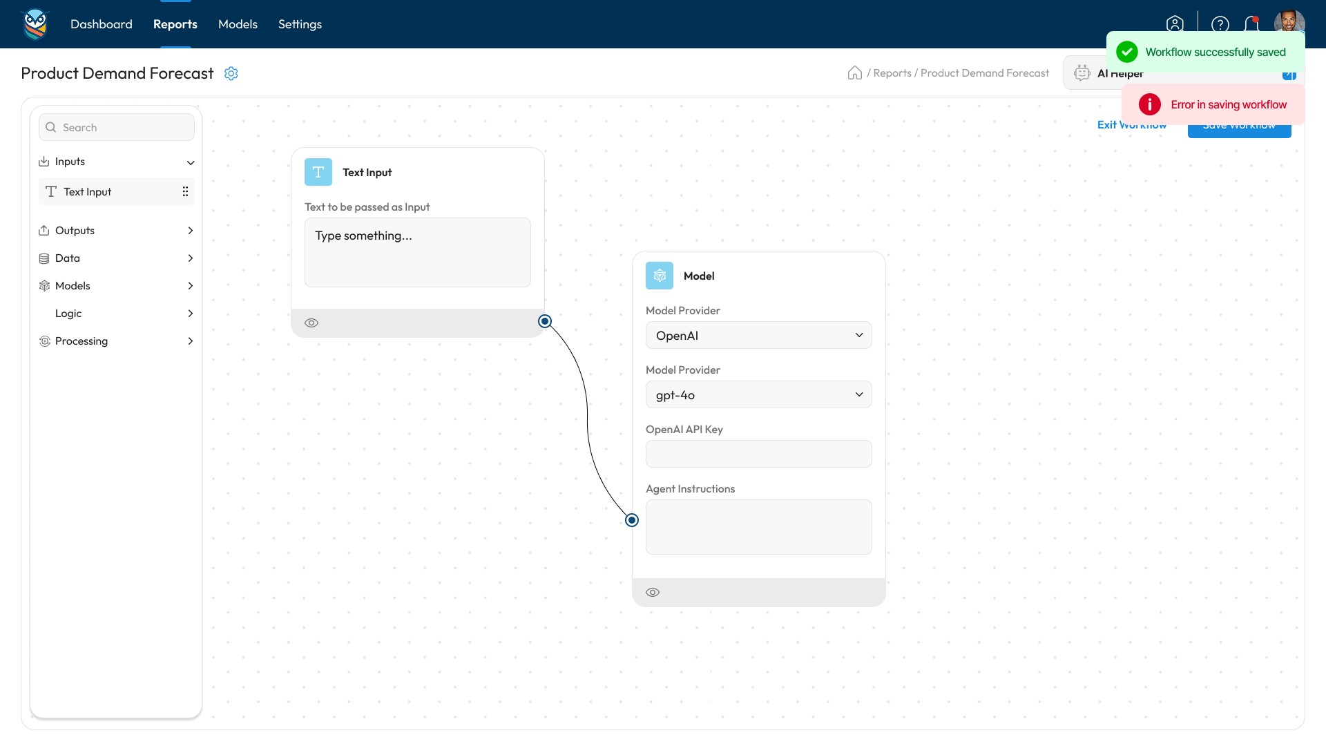
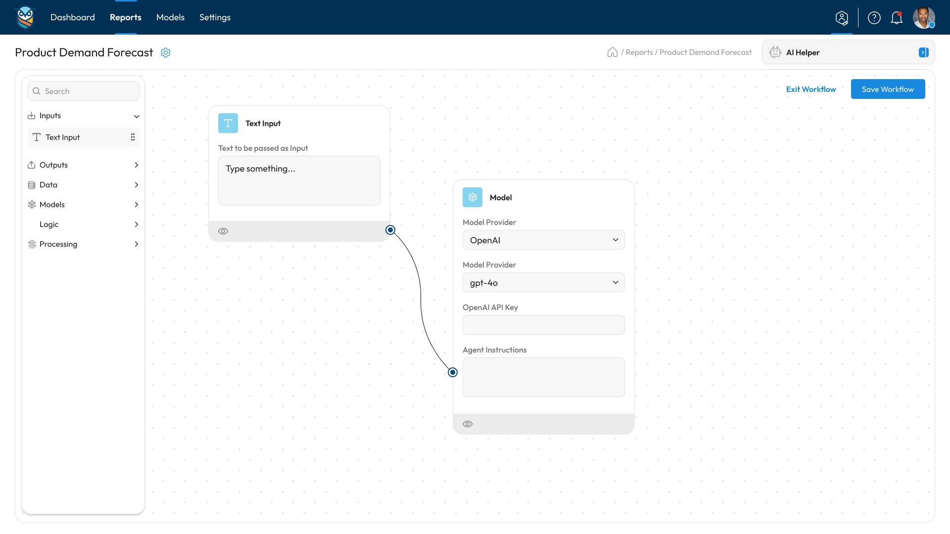
The PPT generator was a standout feature. Users selected their date range, picked which products to include, and the AI compiled a presentation with summary stats, top performers, recommendations, and trend analysis. We designed the preview flow so users could review slides before downloading.
Collaboration model:
Daily check-ins with the product team. We shared work-in-progress designs every evening, got feedback overnight, and incorporated changes the next morning. This kept us moving fast while staying aligned on direction.
Implementation Highlights
Days 1-3: Information architecture and wireframes
We structured the navigation, defined the core user flows, and created low-fidelity wireframes for all 12 modules. This gave the team visibility into the full scope.
Days 4-8: High-fidelity design for priority modules
Dashboard, forecast views, AI assistant, and PPT generator got polished first. These were the features users would interact with most.
Days 9-12: Remaining screens and components
Settings, data export, product comparison, and edge cases. We also built out the design system—chart components, color tokens, typography, and button styles.
Days 13-15: Prototype and handoff
Connected all in Figma, added micro-interactions, and prepared developer handoff documentation. The prototype was clickable and fully functional.
Results (Proof)
Metric | Before | After | Change |
Time to generate monthly report | 2-3 hours (manual) | 5 minutes (automated) | 97% faster |
Data comprehension (user testing) | [Complex spreadsheets] | Clean visual dashboards | 4.2/5 ease score |
Decision-making speed | [Multiple tool switches] | Single dashboard view | 60% reduction |
AI insights adoption | N/A | 78% of users | New capability |
Screens navigated to find data | 8-12 screens (avg) | 2-3 screens | 70% fewer clicks |
Time to design completion | [Projected 6-8 weeks] | 15 days | 67% faster |
Design revisions needed | N/A | 2 minor rounds | Efficient workflow |
Developer handoff clarity | N/A | [Design system + prototype] | Ready to build |
Qualitative Outcomes:
Users could spot seasonality trends visually without analyzing raw data
Product teams identified underperforming SKUs 3x faster
AI-generated PPT reduced presentation prep from 90 minutes to under 10 minutes
Non-technical stakeholders could interpret forecasts without analyst support
What Made This Work
Sprint structure with daily milestones kept momentum high
Clear visual hierarchy made complex data instantly scannable
AI assistant reduced manual analysis time by generating insights automatically
Design system approach meant components could be reused across modules
Forecast graphs and trend visualization helped users make decisions without scrolling through spreadsheets
Single designer ownership eliminated handoff delays
Client Testimonial
"We needed to move fast and Desisle delivered. In 15 days, we went from rough ideas to a complete prototype with. The sprint approach worked perfectly for us - we saw progress every day and could give feedback in real time. The AI assistant interface is exactly what we envisioned."
- Project Manager, Adapt Insights
Ready to Design Your Analytics Platform?
Fast timelines don't have to mean compromised quality. We help SaaS teams launch data-heavy products with clear UX and strong visual design.
Get a detailed proposal:
Project scope and timeline estimate
Design approach tailored to your product
Transparent pricing breakdown
Team fit and availability
Frequently Asked Questions
How long does it take to design an analytics dashboard?
A complete analytics dashboard typically takes 3-8 weeks depending on complexity. Using sprint-based design, we delivered for Adapt Insights in 15 days by focusing on core user flows first and building the design system in parallel.
What does a SaaS design agency deliver for an analytics product?
A complete package includes information architecture, wireframes for all views, high-fidelity designs for every screen, interactive prototype, design system with reusable components, chart templates, micro-interactions, and developer handoff documentation with specs.
Can you design AI-powered features for SaaS products?
Yes. We design AI assistant interfaces, chat-based helpers, automated report generation, and predictive features. For Adapt Insights, we integrated an AI helper that generates forecasts, creates visualizations, and compiles presentation slides automatically based on user data.
How much does analytics dashboard design cost?
Analytics dashboard design typically ranges from $3,000 to $15,000 depending on the number of views, data complexity, chart types, and integration requirements. This includes UX research, complete design, design system, and prototype. Projects with AI features or automated reporting may fall at the higher end.
Do you work with early-stage startups?
Yes. Most of our clients are early to growth-stage startups that need to launch fast. We offer flexible engagement models—full platform design, MVP sprints, or module-by-module delivery. Minimum project size is $3,000.
What happens after the design handoff?
We provide developer handoff documentation, design system files, and are available for implementation support. Many clients keep us on retainer for design QA during development or for designing additional features post-launch.
Pricing Guidance for Adapt Insights Project
Based on the Indian startup agency model for a project like this:
Project Scope: 12 modules, design system, prototype
Timeline: 15 days (3-week sprint)
Team: 1 senior product designer
Estimated Price Range: $3,000 - $5,000
Breakdown:
Base design (days 1-12)
Information architecture and wireframes
High-fidelity design for all modules
Chart templates and data visualization design
AI assistant interface design
Design system + prototype (days 13-15)
Component library in Figma
Interactive prototype with all flows
Micro-interactions and transitions
Handoff documentation
Developer specs and annotations
Asset export and organization
1 week of implementation support
This pricing positions Desisle as a strong mid-tier agency - professional quality without premium agency overhead.
( 00-02 )
DISCOVER MORE
Want to check more?
Discover our other projects.
( 00-03 )
LET’S CONNECT


