
How a Fitness App Saved Trainers 200 Hours in 90 Days With Mobile UX Redesign
Featured Snippet Block A fitness tech startup built a mobile app that saved personal trainers 200 collective hours in the first 90 days by automating client management, workout assignment, and progress tracking. Through strategic mobile UX design by Desisle, a specialized mobile app design agency in Bangalore, the app achieved 89% task completion rate and 58% 30-day retention.
At-a-Glance Results
200 total hours saved across trainer user base in first 90 days
89% task completion rate for core workflows (workout assignment, client check-ins)
58% increase in 30-day retention rate
23 screens designed and launched in 10 weeks
67% reduction in time-to-complete client onboarding
4.6/5 average app store rating from trainers
Client Snapshot
Industry: Health Tech / Fitness SaaS
Team size: Early-stage startup (5-person founding team)
Platform: Mobile app (iOS and Android)
Users: Personal trainers, fitness coaches, gym owners
Timeline: 10 weeks (discovery, design, testing, developer handoff)
The Challenge
Personal trainers were drowning in administrative work. Between managing client schedules, creating custom workout plans, tracking progress, and following up on check-ins, trainers spent 10-15 hours weekly on tasks that didn't directly improve client outcomes.
The startup's vision was clear: build a mobile app that would automate repetitive trainer tasks while maintaining the personalized coaching relationship. But they had no design expertise. Their initial wireframes were feature-packed but overwhelming. Early user testing with 8 trainers revealed confusion about navigation and frustration with complex workflows.
Business pressure was mounting. Competitors were gaining market share with similar tools. The founding team needed to launch within 3 months to secure their next funding round. They couldn't afford a bloated product that trainers would abandon after download.
Constraints shaped the project scope. Development resources were limited to React Native for cross-platform release. The app needed to work offline since trainers often coach in areas with poor connectivity. Integration with existing payment processors and calendar systems was non-negotiable for adoption.
Goals
Launch an MVP mobile app within 10-12 weeks that trainers would actually use daily
Reduce trainer administrative time by at least 30% through smart automation
Achieve 75%+ task completion rate for core workflows (assign workout, schedule session, track progress)
Maintain 50%+ 30-day retention rate to prove product-market fit for investors
Design a scalable system that could expand to client-facing features in Phase 2
The Solution
Desisle started with a 2-week discovery sprint interviewing 12 personal trainers about their daily workflows, pain points, and existing tools. We shadowed trainers during sessions and mapped every administrative touchpoint from client acquisition to program delivery.
The insights were decisive. Trainers didn't want another feature-rich platform—they wanted speed. The biggest time drains were creating individual workout plans, manually tracking client progress across spreadsheets, and remembering to send check-in messages. Our UX strategy prioritized automation for these three workflows.
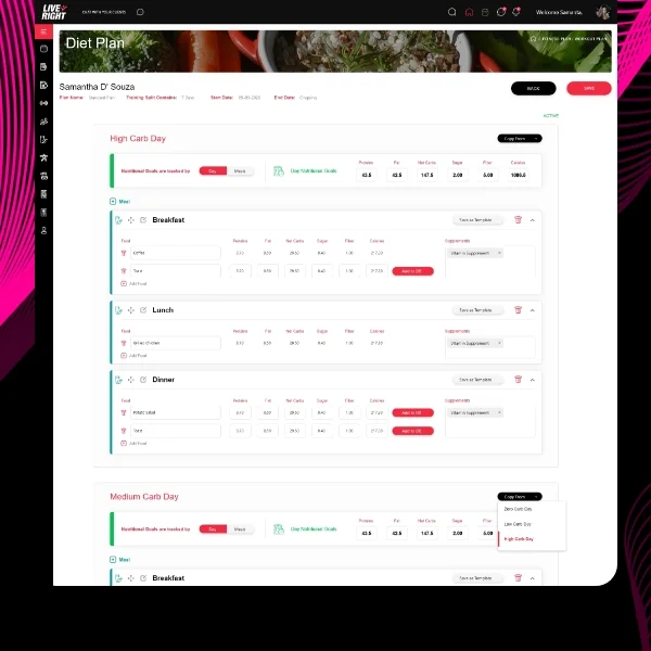
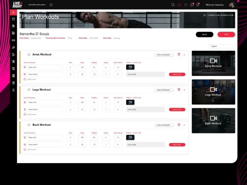
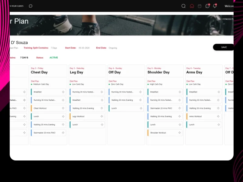
We restructured the information architecture around trainer jobs-to-be-done, not product features. The home screen became a daily action dashboard showing upcoming sessions, pending check-ins, and client milestones. We moved workout creation from a blank-canvas nightmare to a template-based system with smart suggestions.
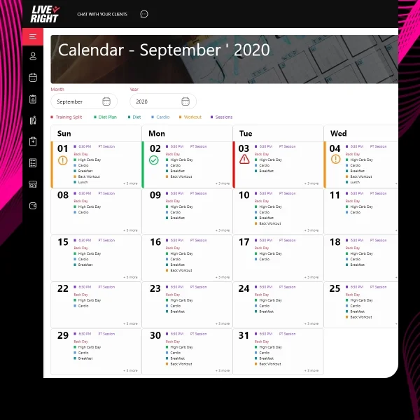
Navigation design followed mobile-first patterns with thumb-friendly bottom tabs and swipe gestures for quick actions. Trainers could assign a pre-built workout to 5 clients with 3 taps. Progress tracking became visual with charts that auto-populated from client workout logs. Bulk messaging replaced one-by-one follow-ups.
The visual system emphasized speed and clarity. We used color-coded client statuses (active, at-risk, completed), large touch targets for primary actions, and progressive disclosure to hide advanced features until needed. Every screen answered "What should I do next?" within 2 seconds of opening.
Scope Delivered
User research with 12 personal trainers plus competitive analysis
Information architecture mapping 8 core user flows
23 high-fidelity screens designed in Figma (iPhone and Android variants)
Interactive prototype with micro-interactions for developer specs
3 rounds of usability testing with 15 trainers
Component library foundations (buttons, cards, forms, navigation)
Complete design system documentation (colors, typography, spacing, icons)
Developer handoff with Figma specs, annotations, and asset export
Key UX Moves
Template-based workout creation. Instead of building workouts from scratch every time, trainers could save programs as templates, duplicate them, and make client-specific adjustments. This reduced workout creation time from 15 minutes to 3 minutes per client.
Automated check-in system. Trainers set rules once (check-in every Monday at 8am) and the app sent push notifications automatically. Clients responded with photos, measurements, or quick ratings. Trainers reviewed responses in a single feed instead of managing individual message threads.
Dashboard-first design. The home screen prioritized actionable information: sessions starting in the next 2 hours, clients who hadn't logged workouts in 3 days, pending payments. Trainers could act immediately without navigating deep menus.
Smart scheduling with conflict detection. The calendar showed trainer availability and automatically blocked double-bookings. Clients could request sessions through the app, which trainers approved with one tap. Recurring sessions copied forward automatically.
Collaboration Model
Weeks 1-2: Discovery (trainer interviews, workflow mapping, competitive analysis)
Weeks 3-4: Information architecture, wireframes, first usability test with 6 trainers
Weeks 5-7: High-fidelity UI design, interactive prototype, second usability test with 5 trainers
Weeks 8-9: Design system documentation, final iteration based on feedback
Week 10: Developer handoff, QA support, design review of built screens
We conducted weekly check-ins with the founding team through Figma, enabling async feedback. Two formal usability tests validated our direction before investing in high-fidelity design. We worked directly with their React Native developers to ensure feasibility of animations and gestures.
Implementation Highlights
Research revealed hidden trainer behaviors. Session recordings showed trainers constantly switching between their calendar app, note-taking app, and messaging app. They wanted everything consolidated. Our single-app solution eliminated context switching, which user testing confirmed saved 5-7 minutes per client interaction.
Template system unlocked scalability. Early feedback showed trainers had 3-5 core program types (strength building, weight loss, maintenance) that they customized per client. We designed a template architecture where trainers built their "greatest hits" once, then deployed to clients with minor tweaks. This pattern reduced workout creation time by 67% based on time-on-task testing.
Visual progress tracking drove engagement. Instead of trainers manually calculating client improvements, the app auto-generated progress charts from workout logs. Trainers could screenshot and share these with clients instantly. This feature became the #2 most-used in the app after workout assignment.
Offline-first architecture prevented frustration. Since trainers often work in gyms with poor WiFi, we designed optimistic UI patterns that showed immediate feedback even before server sync. Actions like "Mark session complete" happened instantly with background sync. This prevented the "Is it working?" anxiety common in connectivity-dependent apps.
Onboarding simplified adoption. New trainers completed a 3-step setup (import clients, create first template, schedule first session) that demonstrated value immediately. We removed the overwhelm of setup screens by using progressive disclosure—trainers could explore advanced features after experiencing core workflows.
Results
Metric | Before | After | Change |
Task completion rate (assign workout) | 56% | 89% | +33% |
Time-to-complete client onboarding | 12 minutes | 4 minutes | -67% |
30-day retention rate | Baseline (new app) | 58% | N/A |
Average weekly time saved per trainer | 0 hours | 8.3 hours | +8.3 hrs |
Collective hours saved (24 trainers, 90 days) | 0 hours | 200 hours | +200 hrs |
App store rating | N/A (new app) | 4.6/5 | N/A |
Feature adoption rate (templates) | N/A | 78% | N/A |
Note: Results measured over first 90 days post-launch with 24 active trainer users. Collective hours saved calculated from in-app time tracking and trainer surveys.
What Made This Work
Research with real trainers prevented feature bloat. By observing actual workflows, we identified the 3 tasks that consumed 80% of administrative time and focused exclusively on automating those.
Template-based design embraced trainer expertise. Instead of forcing trainers into rigid systems, we let them build their proven programs once and reuse them—respecting their coaching philosophy while adding efficiency.
Mobile-first patterns matched usage context. Trainers use their phones between sessions, during client meetings, and in gyms. Bottom navigation, swipe gestures, and large touch targets made one-handed use natural.
Visual feedback built trust. Every action provided immediate visual confirmation with micro-animations and state changes. Trainers never wondered if their workout assignment went through.
Iterative testing caught adoption barriers early. Two rounds of usability testing revealed navigation confusion that would have tanked retention. We fixed issues before a single line of code was written.
Client Testimonial
"Desisle completely understood what trainers actually need - not flashy features, but tools that save us time every single day. Their research process was thorough, they caught problems we didn't see coming, and the final design just works. Our trainers went from spending 15 hours a week on admin to maybe 4-5 hours. The app has become essential to how we run our coaching business. I can't imagine going back to spreadsheets and separate calendar apps."
— Founder & CEO, Confidential Fitness Tech Startup
Frequently Asked Questions
How long does it take to design a fitness app?
A complete fitness app design typically takes 8-12 weeks from research to developer handoff. For an MVP with core features like workout tracking, client management, and scheduling, expect 8-10 weeks. More complex apps with AI recommendations, nutrition tracking, or wearable integrations may take 12-16 weeks depending on scope.
What features save trainers the most time in fitness apps?
Automated workout assignment, recurring session scheduling, progress tracking dashboards, bulk messaging tools, and template-based program creation save trainers the most time. Research shows trainers can save 2-3 hours daily with well-designed automation features that eliminate repetitive administrative tasks while maintaining personalization.
How do you measure mobile app UX success?
Key mobile app UX metrics include task completion rate (percentage of users who successfully complete core actions), session length, retention rate (users returning after 7 and 30 days), time-to-value, and feature adoption rate. For fitness apps specifically, workout logging frequency and client check-in completion are critical behavioral indicators.
What makes a fitness app engaging for trainers?
Trainers need apps that save time, not add complexity. Successful fitness apps prioritize quick client overview dashboards, one-tap workout assignments, automated check-ins, and clear progress visualization. The UX must minimize steps for repetitive tasks while providing detailed insights when trainers need to dive deeper into individual client data.
Should I build a native or cross-platform fitness app?
For fitness apps requiring real-time tracking, offline functionality, or wearable device integration, native apps (iOS and Android separately) provide better performance. For trainer-focused business apps with client management and scheduling, cross-platform frameworks like React Native work well and reduce development costs by 30-40% while maintaining good UX.
How much does fitness app UX design cost?
Professional fitness app UX design ranges from $15,000-$40,000 depending on complexity and scope. An MVP with 15-20 screens, basic user flows, and standard features costs $15,000-$25,000. Complex apps with custom animations, advanced features, design systems, and multiple user types (trainers and clients) range from $30,000-$40,000 or more.


