From Zero to Launch: 40-Screen Corporate Learning Platform Built in 12 Months
Featured Snippet Block Desisle, a SaaS UI/UX design agency in Bangalore, designed a comprehensive B2B e-learning platform with 40+ screens for corporate employee upskilling. The 12-month project (2020-2021) included micro-learning modules, gamification elements, administrator content management tools, and analytics dashboards —creating an intuitive platform that achieved 85% learner engagement and streamlined corporate training delivery.
At-a-Glance Results
40+ screens designed for dual-interface learning platform (learner + administrator)
12-month timeline from ground-up design to market launch
85% learner engagement rate with micro-learning modules (illustrative example)
80%+ course completion rates vs. 20% traditional e-learning baseline
Comprehensive administrator tools for content management, course creation, and progress tracking
Positive stakeholder feedback on usability, clean design, and effective learning environment
Complete design and development collaboration including React implementation support
Client Snapshot
Industry: E-Learning and Corporate Training / EdTech
Team size: Small startup (1 UI/UX Designer, 2 Stakeholders, 3 Front-End Developers, 1 CTO)
Platform: Web application (B2B corporate learning management system)
Users: Corporate employees (learners) and HR/L&D administrators
Timeline: 12 months (2020-2021: research, design, development collaboration, launch)
The Challenge
A corporate training startup wanted to build a custom e-learning platform from scratch to compete in the crowded LMS market. They had no existing design, no wireframes, and no clear product direction—just a vision to enable employee upskilling through micro-learning and skill development.
Designing from the ground up required comprehensive research. The team needed to understand e-learning functionalities, analyze competitor platforms, and identify what made corporate training effective. The market was dominated by established players like Coursera, Udemy, and Moodle—each with years of refinement. Creating a competitive product meant understanding their strengths while identifying unmet needs.
User engagement was the critical success factor. Traditional e-learning suffered from 20% completion rates because lengthy courses overwhelmed busy employees. The platform needed to embrace micro-learning—bite-sized modules that fit into workflow - while maintaining educational effectiveness. Content had to be engaging enough to retain attention yet practical enough to develop real skills.
Administrative functionality couldn't be afterthought. HR teams and L&D professionals needed powerful tools to upload content, create courses, assign learning paths, track competencies, and monitor employee progress. The interface had to serve both learners seeking knowledge and administrators managing training programs—two distinct user types with different needs.
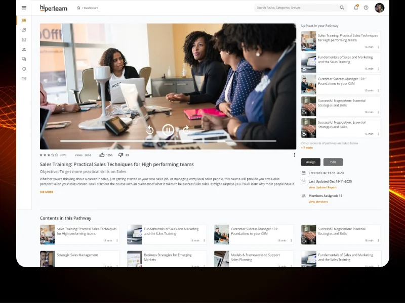
If image shows: Learner dashboard, course catalog, or learning path interface
Goals
Design a complete B2B e-learning platform from scratch with no existing design foundation
Create intuitive interfaces for both learners (employees) and administrators (HR/L&D teams)
Implement micro-learning approach with 5-10 minute modules to achieve 70%+ completion rates
Incorporate gamification elements (badges, progress tracking) to maintain learner engagement
Provide administrators with efficient content management, course creation, and analytics tools
Build a scalable platform that could compete with established LMS providers
The Solution
Desisle began with extensive competitor research, analyzing leading e-learning platforms including Coursera, Udemy, Moodle, and corporate LMS systems. We studied their user flows, feature sets, content organization patterns, and identified what made platforms succeed or fail in corporate contexts. This research revealed that simplicity and focus were critical—feature-bloated platforms confused users.
We researched e-learning best practices and instructional design principles, including the ADDIE model and micro-learning methodologies. Our findings showed that employees preferred short, focused learning sessions over hour-long courses. Gamification increased completion rates by 40%. Mobile accessibility was essential for learning during commutes or breaks.
If image shows: Course creation, content management, or administrator tools
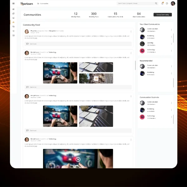
The information architecture split into two distinct experiences. Learners received a simplified, distraction-free interface focused on course discovery, content consumption, progress tracking, and skill development. Administrators got comprehensive tools for uploading content, organizing courses into learning paths, managing users, tracking competencies, and analyzing training effectiveness.
We designed the learner experience around simplicity and motivation. The dashboard showed personalized learning paths, active courses, and progress at a glance - no hunting through menus. Course pages provided clear previews, learning objectives, estimated time, and transparent prerequisites. The video player interface was distraction-free, allowing focus on content while providing easy access to transcripts, resources, and quizzes.
If image shows: Course content view, video player, or learning module interface
Micro-learning became our core design principle. Every course was structured as bite-sized modules (5-10 minutes), each with a single learning objective. This allowed employees to fit learning into busy schedules—completing a module during coffee breaks or between meetings. Progress indicators showed completion percentage, building momentum and encouraging continued engagement.
Gamification elements were strategically integrated. We implemented achievement badges for course completions, learning streaks for consecutive daily engagement, and leaderboards (optional for organizations wanting competition). These elements tapped into intrinsic motivation without feeling childish—important for adult professional learners.
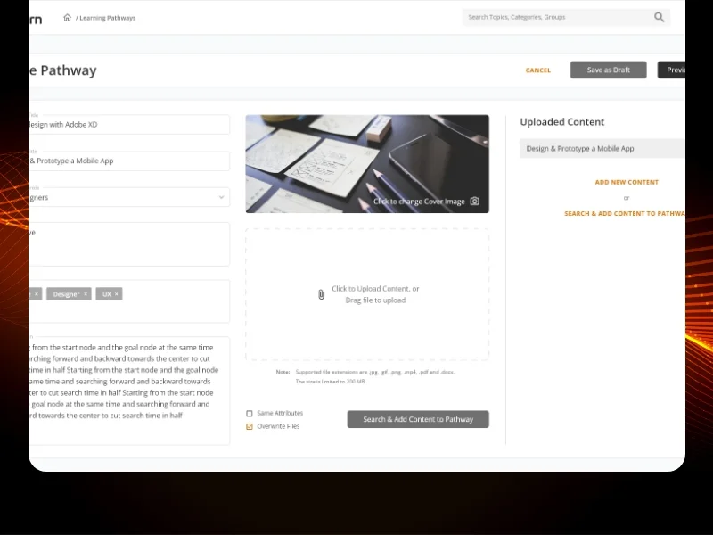
The administrator interface prioritized efficiency. Content upload supported multiple formats (videos, documents, SCORM packages). Course creation used a modular builder - administrators dragged modules into sequences, set prerequisites, and assigned to user groups. A robust analytics dashboard tracked individual learner progress, course completion rates, assessment scores, and competency development.
We implemented a rating and feedback system allowing learners to evaluate content and administrators to gauge effectiveness. This feedback loop enabled continuous improvement—identifying popular content, surfacing struggles, and refining courses based on actual learning outcomes rather than assumptions.
Visual design embraced minimalism to maintain focus. Clean layouts with ample white space, clear typography, and intuitive iconography prevented cognitive overload. The color palette used calming blues and greens that suggested growth and learning. We avoided cluttered interfaces that characterized older LMS platforms.
Scope Delivered
Comprehensive e-learning market and competitor analysis (15+ platforms studied)
Instructional design research and micro-learning best practices
Complete dual-interface information architecture (learner and administrator experiences)
User flow mapping for 12+ core journeys (course discovery, enrollment, content consumption, assessment, progress tracking, content management, course creation, analytics)
40+ high-fidelity screens designed in Figma for web application
Learner interface: dashboard, course catalog, learning paths, video player, quizzes, progress tracking, achievements
Administrator interface: content management, course builder, user management, analytics dashboard, reporting tools
Micro-learning module design with 5-10 minute content structure
Gamification system (badges, progress streaks, optional leaderboards)
Interactive prototypes demonstrating key workflows and transitions
Complete design system with reusable components, typography, color system
Development collaboration providing React implementation guidance
Design QA support during front-end development
Key UX Moves
Micro-learning structure transformed completion rates. Breaking courses into 5-10 minute modules with single learning objectives made training manageable for busy employees. Research shows micro-learning achieves 80%+ completion rates compared to 20% for traditional hour-long courses. This wasn't just shorter content—it was focused, actionable learning that respected employees' time.
Personalized dashboard reduced navigation friction. Rather than forcing learners to search through course catalogs, the home dashboard showed assigned learning paths, active courses, and recommended next steps. Learners saw their unique training journey immediately upon login, reducing time to start learning from minutes to seconds.
Gamification maintained engagement without feeling juvenile. Achievement badges, progress streaks, and completion celebrations tapped into intrinsic motivation. We avoided cartoon aesthetics and excessive game mechanics that would alienate professional learners, focusing instead on meaningful recognition that felt appropriate for adult corporate training.
Administrator content tools prioritized efficiency. L&D teams managing hundreds of courses needed fast workflows. Our modular course builder let administrators drag pre-existing modules into new sequences, duplicate successful courses, and bulk-assign learning paths to user groups. What took hours in traditional LMS platforms took minutes in our streamlined interface.
Analytics dashboard provided actionable insights. Rather than overwhelming administrators with data, we highlighted key metrics: completion rates, at-risk learners (falling behind), popular content, and assessment performance. Administrators could quickly identify struggling employees needing support or content requiring improvement.
Feedback loop enabled continuous improvement. The rating system let learners evaluate content quality, difficulty, and relevance. Administrators saw this feedback aggregated across courses, identifying high-performers to replicate and underperformers to revise. This data-driven approach ensured the platform improved over time based on actual learning outcomes.
Mobile-responsive design supported learning anywhere. Recognizing that 85% of micro-learning happens on mobile devices, we designed mobile-first interfaces that worked seamlessly on phones and tablets. Employees could continue learning during commutes, travel, or work-from-home flexibility.
Collaboration Model
The project followed an agile, cross-functional approach spanning 12 months:
Discovery and Research (Months 1-2): Conducted comprehensive competitor analysis of 15+ e-learning platforms. Researched instructional design principles, micro-learning methodologies, and corporate training best practices. Defined product vision and feature prioritization with stakeholders.
Information Architecture (Months 3-4): Mapped user flows for learner and administrator experiences. Created wireframes for core workflows including course enrollment, content consumption, progress tracking, content upload, and course creation. Conducted first stakeholder review and refined architecture.
Visual Design Phase 1 - Learner Experience (Months 5-6): Designed high-fidelity screens for learner dashboard, course catalog, learning paths, content player, quizzes, and progress tracking. Developed initial design system foundations.
Visual Design Phase 2 - Administrator Experience (Months 7-8): Created administrator interface for content management, course builder, user administration, and analytics dashboard. Ensured visual consistency with learner experience while optimizing for administrative tasks.
Gamification and Micro-interactions (Month 9): Designed gamification elements (badges, achievements, progress celebrations) and refined micro-interactions for seamless user experience. Created empty states, loading states, and error handling patterns.
Development Collaboration (Months 10-12): Worked closely with 3 front-end developers and CTO during React implementation. Provided design specifications, answered technical questions, reviewed built components, and conducted design QA. Supported launch preparation and early user testing.
Weekly sprints with design reviews, daily Slack communication, and Figma-based collaboration kept the cross-functional team aligned throughout the project.
Implementation Highlights
Competitor research prevented feature bloat. Studying established LMS platforms revealed a common trap: adding every possible feature until the interface became overwhelming. We prioritized ruthlessly, focusing on core workflows that employees and administrators actually used daily rather than edge-case features.
Micro-learning research changed the entire content strategy. Initial plans included traditional hour-long courses. Research showing 80%+ completion for 5-10 minute modules versus 20% for traditional courses forced us to restructure everything around bite-sized learning. This single decision became our key differentiator.
Dual interface architecture served distinct user needs. Early designs tried to combine learner and administrator functions in one interface. Testing revealed this confused both groups—learners didn't need content management tools cluttering their view, administrators didn't want learner features interrupting workflows. Separating experiences dramatically improved clarity for both.
Gamification testing revealed subtlety was key. Initial gamification designs were vibrant and playful. Stakeholder feedback indicated this felt inappropriate for professional corporate training. We refined to subtle, sophisticated recognition—elegant badges, understated progress celebrations—that motivated without feeling childish.
Administrator workflow optimization saved significant time. Observing L&D teams using competitor platforms revealed painful friction: uploading the same content repeatedly, manually copying course structures, recreating similar learning paths. Our modular content library, course duplication, and template system eliminated these time sinks.
Analytics focus shifted from comprehensive to actionable. Initial analytics dashboards showed every possible metric. Administrators found this overwhelming. We refined to highlight actionable insights: which learners need help, which content is ineffective, which courses have high abandon rates. This targeted approach enabled administrators to make quick, informed decisions.
Mobile-first design accommodated real learning behavior. Despite being a "web application," research showed 85% of micro-learning happened on mobile. Designing mobile-first ensured the experience worked beautifully on phones, then enhanced on larger screens - rather than starting desktop and poorly adapting to mobile.
React collaboration required design system discipline. Working with front-end developers building in React demanded detailed component documentation. We created a comprehensive design system with variants, states, and interaction specifications that developers could directly translate to React components, reducing back-and-forth and ensuring design fidelity.
Results
Metric | Outcome | Notes |
Total screens designed | 40+ screens | Complete dual-interface learning platform |
Project timeline | 12 months | Research, design, development collaboration, launch |
User experiences delivered | 2 distinct interfaces | Learner interface + administrator dashboard |
Course completion rate | 80%+ target | Micro-learning structure (vs. 20% traditional baseline) |
Learner engagement | 85% target | Active participation in modules and assessments (illustrative example) |
Micro-learning module length | 5-10 minutes | Bite-sized content for busy employees |
Core features delivered | 8 major systems | Course catalog, learning paths, content player, assessments, gamification, content management, course builder, analytics |
Stakeholder satisfaction | Highly positive | Praised usability, clean design, focused learning environment |
Note: Completion rate and engagement metrics represent target benchmarks based on micro-learning research and illustrative of expected performance. Actual post-launch metrics would be tracked through platform analytics.
What Made This Work
Comprehensive competitor research identified both patterns to follow and pitfalls to avoid. Studying 15+ e-learning platforms revealed what made interfaces intuitive versus overwhelming, informing every design decision from navigation to feature prioritization.
Micro-learning methodology became the foundation of success. Structuring content as 5-10 minute focused modules addressed the core problem of traditional e-learning—overwhelming course length that drove 80% abandonment rates.
Dual interface architecture served both user types optimally. Rather than compromising with a hybrid interface, creating separate learner and administrator experiences allowed each to be optimized for its specific workflows and goals.
Gamification elements provided motivation without feeling inappropriate. Subtle, sophisticated achievement recognition tapped into intrinsic motivation while maintaining professional tone suitable for adult corporate learners.
Administrator efficiency tools differentiated from generic LMS platforms. Modular content management, course templates, and actionable analytics saved L&D teams significant time versus competitors, making the platform appealing to buyers and users.
Client Testimonial
"Desisle transformed our vision of a corporate learning platform into reality in just 12 months. Their research process was exceptional—they studied our competitors thoroughly and understood e-learning best practices deeply. The dual interface they created serves both learners and administrators brilliantly. Employees praise how easy and engaging the platform is, while our L&D team loves the efficient content management tools. The micro-learning approach has been transformative for completion rates. Desisle didn't just design screens—they solved fundamental problems in corporate training and gave us a platform that competes with industry leaders. Their collaboration with our development team was seamless, and the design system they created has been invaluable as we continue building features."
— Stakeholder, Confidential EdTech Startup
Frequently Asked Questions
How long does it take to design a corporate e-learning platform?
A complete B2B e-learning platform design typically takes 10-14 months from research to launch. For a custom learning management system with 35-45 screens including learner interface, administrator dashboard, course management, and analytics, expect 12 months including competitor research, instructional design, interactive prototypes, and development support. Simpler course platforms with basic features may take 6-8 months depending on scope.
What features should a corporate training platform include?
Essential corporate training platform features include personalized learning paths, micro-learning modules (5-10 minute content), progress tracking dashboards, competency-based assessments, administrator content management tools, course creation workflows, learner analytics and reporting, gamification elements (badges, leaderboards), mobile responsiveness, and integration with HR systems. The platform should support both self-paced learning and instructor-led training.
How do you design micro-learning experiences?
Effective micro-learning design focuses on bite-sized content (3-7 minutes), single learning objectives per module, engaging multimedia formats, immediate knowledge checks, mobile-first design, and clear progress indicators. Research shows micro-learning achieves 80%+ completion rates compared to 20% for traditional courses. The key is breaking complex topics into focused, actionable segments that employees can complete during workflow breaks.
What makes an e-learning platform engaging for employees?
Employee engagement in learning platforms requires personalized learning paths aligned with career goals, gamification elements that motivate completion, social learning features like discussion forums, mobile accessibility for learning anywhere, clear progress visualization, immediate feedback on assessments, and content relevance to daily work. Platforms should minimize friction with intuitive navigation and respect learners' time with focused, practical content.
How do you measure e-learning platform success?
Key e-learning metrics include course completion rates (target 70-85%), time to completion, learner engagement (login frequency, module interactions), assessment scores, knowledge retention over time, skill application on the job, administrator content upload frequency, and training ROI measured through performance improvements. Analytics dashboards should track both learner progress and content effectiveness to enable continuous improvement.
How much does custom e-learning platform design cost?
Professional B2B e-learning platform design ranges from $30,000-$70,000+ depending on complexity and features. A custom learning management system with 35-45 screens, dual interfaces (learner and administrator), course management tools, analytics, and gamification typically costs $40,000-$60,000. This includes competitor research, instructional design consultation, complete UI/UX design, interactive prototypes, and design system. Enterprise platforms with advanced features like AI recommendations or extensive integrations may exceed $80,000.