From Zero to Market: 32-Screen Bike Delivery App Designed in 12 Months
Featured Snippet Block Desisle, a mobile app UX design agency in Bangalore, designed a comprehensive bike delivery service app with 32 screens for the UAE market. The 12-month project focused on creating an intuitive, minimal-jargon interface for delivery personnel with limited technical proficiency, featuring streamlined task flows, modern minimalist UI, and 3-tap task completion.
At-a-Glance Results
32 screens designed for rider-focused mobile delivery app
12-month timeline from competitor research to market launch (2023-2024)
3-tap maximum task completion for core delivery workflows
Minimalist interface designed for non-technical delivery personnel
Comprehensive competitor and delivery service workflow research
Positive stakeholder feedback on usability and modern design
Complete asset handoff for iOS and Android development
Client Snapshot
Industry: Delivery Services / Logistics Tech
Team size: Early-stage startup (2 stakeholders + design partner)
Platform: Mobile app (iOS and Android - bike delivery riders)
Users: Bike delivery riders in UAE with varied technical proficiency levels
Timeline: 12 months (2023-2024: research, design, iteration, launch support)
The Challenge
A new bike delivery service was entering the competitive UAE market with no design foundation. The startup needed to build a mobile app from scratch that would enable delivery riders - many with limited technical proficiency - to efficiently manage pickups, deliveries, navigation, and earnings tracking.
Starting from zero meant extensive groundwork. The team needed comprehensive competitor research to understand delivery app workflows, feature expectations, and design patterns that worked in real-world delivery contexts. UAE's delivery market was already crowded with established players offering sophisticated apps. Standing out required both innovation and simplicity.
User accessibility was the critical constraint. Delivery personnel ranged from tech-savvy young riders to older individuals with minimal smartphone experience. The app needed to work for everyone regardless of technical background. Riders would use the app while on bikes, in bright sunlight, wearing gloves, and in motion—demanding exceptional usability under challenging conditions.
Market introduction pressure was high. As a new service, the app needed to be immediately intuitive to attract and retain riders. Complicated onboarding, confusing navigation, or technical jargon would drive riders to competitor platforms. The design had to reduce friction at every step while maintaining professional capability.
Goals
Design a complete delivery app from ground up with no existing wireframes or design direction
Create an interface accessible to delivery personnel with limited technical skills and varied literacy levels
Minimize task completion to 3 taps or fewer for core workflows (accept order, navigate, confirm delivery)
Implement modern, minimalist UI that avoids overwhelming non-technical users
Research competitor apps thoroughly to identify best practices and differentiation opportunities
Ensure successful market launch in competitive UAE delivery landscape
The Solution
Desisle began with comprehensive market research, analyzing leading delivery apps across UAE and global markets. We studied competitor workflows, feature sets, and user interface patterns used by established players like Careem, Talabat, and international delivery platforms. This research revealed what riders expected and where opportunities existed for improvement.
We conducted user research with delivery riders to understand their daily workflows, pain points, and technical comfort levels. Riders revealed they wanted quick access to earnings information, clear delivery instructions without excessive text, simple navigation integration, and interfaces that worked with minimal attention while riding. These insights shaped our entire design approach.
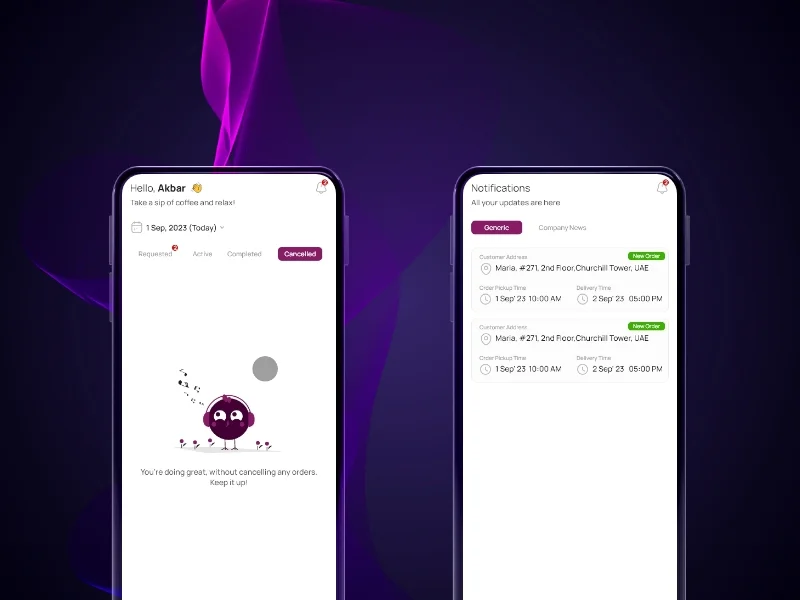
If image shows: Order management screens, rider dashboard, or delivery list
The information architecture prioritized rider efficiency. The home screen became a task-focused dashboard showing active deliveries, pending pickups, and today's earnings—all the information riders needed without navigating deep menus. We organized features by frequency of use rather than logical categories, putting the most common actions within thumb reach.
Task flow optimization became our core principle. Every workflow was designed for minimal taps: accept delivery (1 tap), view details (1 tap), navigate (1 tap). We eliminated confirmation dialogs for routine actions, used swipe gestures for common tasks, and ensured critical information was always visible without scrolling.
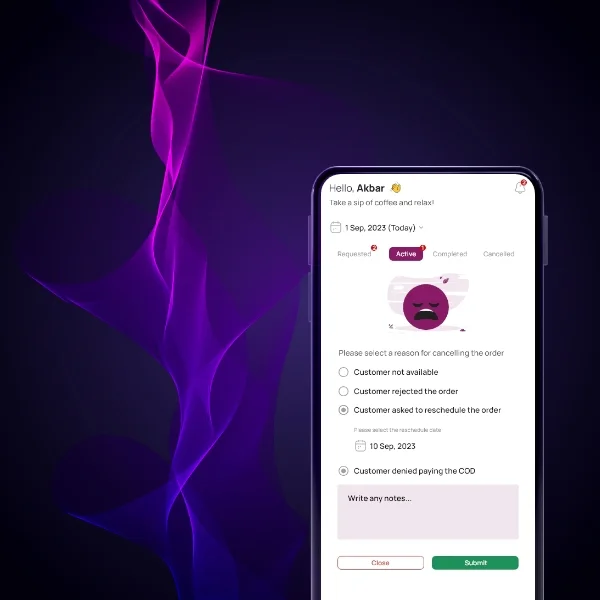
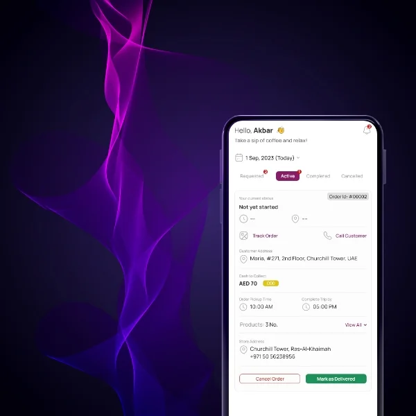
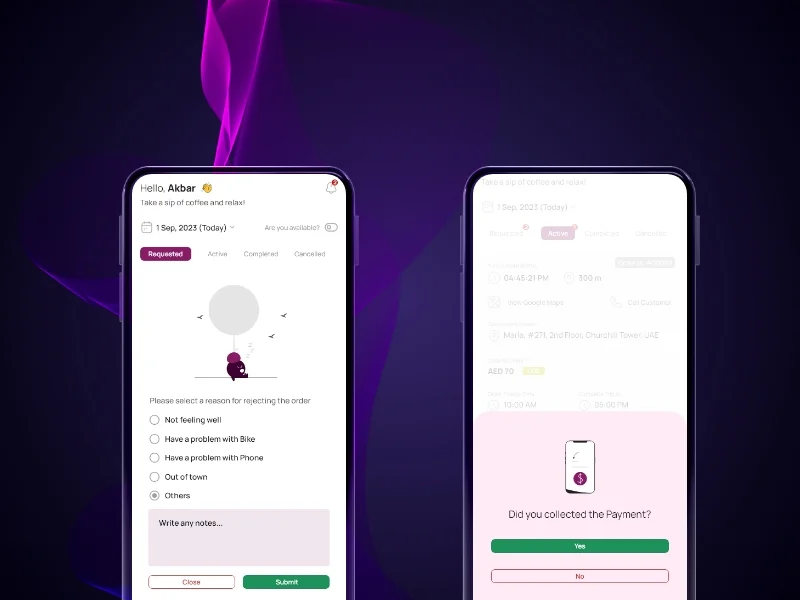
If image shows: Navigation screens, map integration, or delivery confirmation flows
Visual design embraced minimalism. We used a modern UI with ample white space, large touch targets (minimum 48x48 pixels), high-contrast colors readable in bright sunlight, and clear iconography with text labels to avoid confusion. Typography was oversized for readability at a glance. Color coding differentiated pickup (blue) from drop-off (green) locations instantly.
We eliminated technical jargon throughout the interface. Instead of "geolocation," we used "your location." Instead of "pending transactions," we showed "Today's earnings: AED XXX." Every label, button, and instruction used plain language that delivery riders understood immediately regardless of education level.
If image shows: Earnings dashboard, delivery history, or rider performance screens
Navigation architecture was deliberately simple. A bottom tab bar provided access to four core sections: Home (active deliveries), History (completed orders), Earnings (income tracking), and Profile (settings). No nested menus, no hidden features - everything riders needed was two taps away maximum.
If image shows: Additional app screens like settings, profile, or onboarding flows
Scope Delivered
Comprehensive competitor analysis of UAE and international delivery apps
Delivery service workflow research and rider interviews
Complete information architecture optimized for rider tasks
User flow mapping for 10+ core journeys (order acceptance, navigation, delivery confirmation, earnings review)
32 high-fidelity screens designed in Figma for iOS and Android
Core feature screens: order dashboard, delivery details, GPS navigation integration, earnings tracking, delivery history
Minimalist design system with large touch targets, high-contrast colors, readable typography
Interactive prototypes demonstrating task flows and transitions
Complete asset handoff with specifications for iOS and Android developers
Stakeholder collaboration through iterative design reviews
Launch support and design QA during development
Key UX Moves
Minimal-tap task completion became the design mantra. Every core workflow was optimized for 3 taps or fewer. Accept order: 1 tap. View delivery details: 1 tap. Start navigation: 1 tap. Confirm delivery: 1 tap. This efficiency was critical for riders managing multiple deliveries while on bikes.
Home screen as command center eliminated navigation friction. Rather than distributing information across multiple screens, the dashboard consolidated everything riders needed: active orders, pending pickups, today's earnings, and quick actions. Riders could assess their entire workload at a glance without exploring the app.
Plain language replaced technical jargon. Every piece of text was written for riders with varying education levels and technical literacy. Clear instructions like "Pick up from here" and "Deliver to this address" replaced ambiguous labels. Error messages explained problems in simple terms with clear resolution steps.
Visual hierarchy supported quick scanning. Riders often glanced at the app while riding, at traffic lights, or during brief stops. Large typography, bold headings, color-coded status indicators, and ample spacing ensured information could be absorbed in 2-3 seconds.
High-contrast design worked in UAE sunlight. Outdoor visibility was paramount for bike riders working in bright Middle Eastern sun. We tested color contrast ratios extensively, used dark text on light backgrounds, avoided grays, and ensured maps and navigation remained readable in all lighting conditions.
Touch targets accommodated glove use. Delivery riders often wore gloves for sun protection or grip. All interactive elements exceeded 48x48 pixel minimum sizes, with spacing between buttons to prevent mis-taps. Swipe gestures provided alternatives to small button taps for common actions.
GPS integration reduced cognitive load. Rather than forcing riders to copy addresses into separate map apps, one-tap navigation launched Google Maps or Waze with destination pre-loaded. Riders transitioned seamlessly from order details to navigation without manual data entry.
Collaboration Model
The project followed an iterative approach spanning 12 months:
Research Phase (Months 1-2): Conducted extensive competitor analysis of 15+ delivery apps in UAE and international markets. Interviewed delivery riders to understand workflows, pain points, and technical capabilities. Established design principles and feature prioritization.
Information Architecture (Months 3-4): Mapped user flows for all rider tasks from order acceptance through delivery confirmation. Created low-fidelity wireframes and tested navigation concepts with riders. Refined architecture based on feedback emphasizing simplicity.
Visual Design Phase 1 (Months 5-7): Designed high-fidelity screens for core workflows: order dashboard, delivery details, navigation integration, and confirmation flows. Developed minimalist design system with focus on readability and accessibility.
Visual Design Phase 2 (Months 8-9): Created supporting screens for earnings tracking, delivery history, profile management, and settings. Ensured visual consistency while optimizing each screen for its specific purpose.
Refinement and Testing (Months 10-11): Conducted usability testing with delivery riders, observed real-world app usage during deliveries. Refined touch targets, simplified language, improved visual hierarchy based on rider feedback.
Launch Support (Month 12): Delivered complete design assets, specifications, and documentation to development team. Provided design QA during development, reviewed built screens, and ensured implementation matched design vision.
Weekly Figma-based check-ins with stakeholders enabled rapid feedback and maintained design direction alignment throughout the project.
Implementation Highlights
Competitor research revealed both opportunities and requirements. Analyzing established delivery apps showed riders expected certain features (earnings dashboard, order history, GPS integration) as table stakes. But we also identified pain points - cluttered interfaces, hidden earnings information, complex multi-step workflows—that we could improve.
Rider interviews changed initial assumptions. Early wireframes included detailed analytics and performance graphs thinking riders would want comprehensive data. Testing revealed riders primarily cared about three things: today's earnings, next delivery, and navigation. We stripped away everything else from the home screen.
3-tap rule transformed workflow design. Setting a hard limit of 3 taps for any core task forced brutal prioritization. Features that required 4+ taps were redesigned or moved to secondary screens. This constraint created an extremely efficient interface that felt instant compared to competitor apps.
Visual minimalism solved cognitive overload. Delivery apps often cramped information into small screens. Our generous use of white space, clear sectioning, and single-task screens reduced cognitive load. Riders reported the app felt "calm" and "easy to understand" even during stressful rush periods.
Plain language testing caught hidden assumptions. What designers considered "simple" language still confused riders with limited education. Multiple rounds of language testing and refinement with actual delivery personnel ensured every word was immediately clear. For example, "Recipient" became "Customer," "Optimize route" became "Best path."
Sunlight testing validated high-contrast decisions. Testing phone screens in actual UAE midday sun revealed that many color combinations invisible indoors became unreadable outdoors. We increased contrast ratios beyond WCAG minimums and verified all screens were readable in bright conditions.
GPS integration complexity hidden behind simplicity. While the interface showed a single "Navigate" button, behind the scenes we had to handle multiple map app preferences, handle missing GPS, provide fallback address displays, and manage app switching. The technical complexity was invisible to riders who experienced seamless navigation.
Results
Metric | Outcome | Notes |
Total screens designed | 32 screens | Complete rider-focused delivery app |
Project timeline | 12 months | Research, design, testing, launch support |
Maximum task completion taps | 3 taps | Core workflows optimized for speed |
Design system touchpoints | Minimalist UI | Large targets, high contrast, readable typography |
Competitor apps analyzed | 15+ apps | UAE and international delivery platforms |
User testing rounds | 3 iterations | With actual delivery riders in real conditions |
Stakeholder feedback | Overwhelmingly positive | Praised usability, clarity, modern aesthetic |
Market launch status | Successfully launched | UAE market entry 2024 |
Note: As a design-phase project transitioning to launch, long-term usage metrics (rider retention, order completion rates, time-per-delivery) are being collected post-launch. Results reflect deliverables completed and stakeholder/early-user feedback during the 12-month design process.
What Made This Work
Comprehensive competitor research prevented reinventing delivery app patterns. Analyzing 15+ existing apps revealed what riders expected, what frustrated them, and where opportunities existed to differentiate through superior usability.
Designing for lowest technical proficiency ensured universal usability. By optimizing for riders with minimal smartphone experience, we created an interface that felt effortless for all users regardless of technical background.
3-tap maximum rule forced extreme simplification. This constraint eliminated unnecessary complexity and created workflows that felt instant compared to multi-step competitor apps.
Real-world testing in delivery conditions caught issues lab testing missed. Testing while riding, in sunlight, wearing gloves, and during actual deliveries revealed usability problems invisible in office environments.
Plain language and visual clarity made the app accessible across literacy levels. Eliminating jargon and using clear visual communication ensured riders could use the app confidently regardless of education or language proficiency.
Client Testimonial
"Desisle took our delivery app from concept to a polished, market-ready product in 12 months. Their research was exceptional - they studied our competitors thoroughly and interviewed our target riders to truly understand the market. The design they created is exactly what we needed: simple, fast, and accessible to riders of all technical levels. Our riders consistently praise how easy the app is to use, and stakeholders love the modern, professional aesthetic. Desisle didn't just design screens—they solved real problems for our riders and gave us a competitive advantage in the UAE market. The attention to detail, from sunlight-readable colors to minimal-tap workflows, shows they understood the delivery business deeply."
- Founder, Confidential Delivery Platform
Frequently Asked Questions
How long does it take to design a delivery app?
A complete delivery app design typically takes 8-14 months from research to launch. For a rider-focused delivery app with 30-35 screens including core features like order management, GPS tracking, and earnings dashboard, expect 10-12 months including competitor research, user testing with delivery personnel, and iterative design refinement. Simpler delivery tracking apps may take 6-8 months depending on feature complexity.
What features should a delivery driver app include?
Essential delivery driver app features include order list with pickup and drop-off details, integrated GPS navigation or map platform sync, real-time order status updates, earnings dashboard showing daily and cumulative income, delivery proof capture (photos, signatures), in-app messaging with customers and dispatch, and offline mode for poor connectivity areas. The interface should minimize taps required to complete common tasks and work well while riding.
How do you design apps for non-technical users?
Designing for non-technical users requires eliminating jargon, using clear visual cues and icons with text labels, minimizing steps to complete tasks (ideally 3 taps or fewer), providing obvious navigation patterns, using large touch targets for easy interaction, including contextual help without overwhelming the interface, and extensive testing with actual target users. For delivery apps specifically, the design must work in real-world conditions like bright sunlight, while wearing gloves, and during motion.
What makes a delivery app successful in the UAE market?
Successful UAE delivery apps require multilingual support (Arabic and English), cultural considerations in visual design, robust GPS and mapping for complex addresses, payment integration with regional preferences, real-time customer communication, heat-resistant design for outdoor use, and features addressing local traffic patterns. The app must handle the unique challenges of UAE's delivery landscape including diverse expatriate workforce, varied technical literacy, and extreme weather conditions affecting mobile device performance.
How do you optimize delivery apps for riders on bikes?
Bike rider optimization requires hands-free operation support, large buttons and text readable in motion and sunlight, minimal interaction sequences that don't require sustained attention, voice feedback options, quick glance information architecture, weather-resistant interface design, and battery-conscious features since riders rely on phones all day. The app should sync seamlessly with helmet-mounted devices or handlebar phone mounts and work with gloves or in vibration conditions.
How much does delivery app design cost?
Professional delivery app design ranges from $20,000-$50,000+ depending on complexity and market. A rider-focused delivery app with 30-35 screens, GPS integration, order management, and earnings tracking typically costs $25,000-$40,000. This includes competitor research, user testing with delivery personnel, complete UI design, interactive prototypes, and developer handoff. Enterprise delivery platforms with admin dashboards, customer apps, and advanced features may exceed $60,000.