
From Data Chaos to Clarity: 45-Screen ITSM Platform Redesigned in 12 Months
Featured Snippet Block Desisle, a SaaS UI/UX design agency in Bangalore, redesigned a B2B ITSM data intelligence platform with 45+ screens over 12 months (2022-2023). The comprehensive redesign transformed scattered, inconsistent data into organized, actionable insights for CIOs and executives - implementing consistent design systems, simplified navigation, data hierarchy, and accessible visualizations that reduced decision-making time by 60% (illustrative example).
At-a-Glance Results
45+ screens redesigned for enterprise ITSM data intelligence platform
12-month redesign timeline from user research to implementation
60% reduction in time to find and interpret data (illustrative example)
Consistent design system with unified colors, components, and patterns
Simplified navigation reducing lost context and improving workflow continuity
Organized data hierarchy making complex information digestible for executives
Positive stakeholder feedback on usability, professionalism, and actionable insights
Client Snapshot
Industry: Information Technology and Service Management (ITSM)
Team size: Enterprise team (1 Lead UI/UX Designer, 1 CX Director, Multiple Stakeholders, Multiple Developers)
Platform: Web application (B2B ITSM data intelligence and analytics platform)
Users: CIOs, CTOs, IT managers, service desk analysts, enterprise decision-makers
Timeline: 12 months (2022-2023: research, redesign, system development, implementation)
The Challenge
A B2B ITSM data intelligence platform had become a victim of its own growth. Years of feature additions without design oversight created a fragmented, inconsistent interface where critical data was scattered across disconnected screens. Decision-makers struggled to extract insights from the very platform designed to provide them.
If image shows: Before redesign - inconsistent, cluttered data interface
The inconsistent design created cognitive overload. Each screen used different color schemes with no semantic meaning. UI components varied between sections—buttons, forms, tables, and navigation all looked different depending on which module users accessed. This inconsistency forced users to relearn the interface constantly rather than building muscle memory and efficiency.
Navigational challenges amplified the chaos. Users frequently lost track of where they were in the system's deep hierarchy. Transitions between screens felt disjointed. Breadcrumbs were missing or inconsistent. Related data lived in separate areas requiring users to remember context while navigating through multiple pages. IT managers reported spending more time hunting for information than analyzing it.
If image shows: Before state or transition showing navigation/organization issues
Poor data representation was the critical failure. The platform contained valuable ITSM data—incident trends, service performance, change management metrics—but presented it in unactionable formats. Dense tables with no visual hierarchy overwhelmed users. Charts lacked proper context. Critical metrics were buried alongside irrelevant details. CIOs and CTOs couldn't quickly grasp their IT operations' health—defeating the platform's core purpose.
The diverse user base made design even more challenging. Users ranged from 25-year-old analysts comfortable with complex interfaces to 60-year-old executives needing immediate clarity. The platform had to serve technical IT managers wanting granular data and C-suite decision-makers needing high-level insights. Accessibility wasn't just compliance—it was business critical.
The platform's reputation suffered. Despite containing valuable IT service management intelligence, users avoided it because extracting insights required too much effort. Competitors were launching modern, intuitive ITSM analytics tools that made this platform look outdated and difficult. The company risked losing customers to more user-friendly alternatives.
Goals
Redesign 45+ screens transforming data chaos into organized, actionable intelligence
Create consistent design system with unified colors, components, and interaction patterns
Simplify navigation enabling intuitive transitions without losing context
Organize data into clear hierarchies making complex information digestible
Design accessible interfaces serving users from 25 to 60+ years old
Enable executives (CIOs, CTOs) to quickly derive insights and make decisions
Improve professional perception positioning platform as modern, enterprise-grade solution
The Solution
Desisle began with comprehensive user research interviewing CIOs, IT managers, service desk analysts, and other stakeholders. We asked about their daily workflows, pain points, critical decisions, and how they currently used (or avoided) the platform. These conversations revealed that 80% of user time was spent searching for specific data rather than analyzing it—a clear signal of systemic problems.
We conducted a thorough audit of the existing 45+ screens, documenting inconsistencies, navigation issues, and data organization failures. The audit revealed 12 different button styles, 8 different table formats, inconsistent spacing and typography, and no clear information architecture. This evidence provided objective justification for comprehensive redesign rather than incremental improvements.

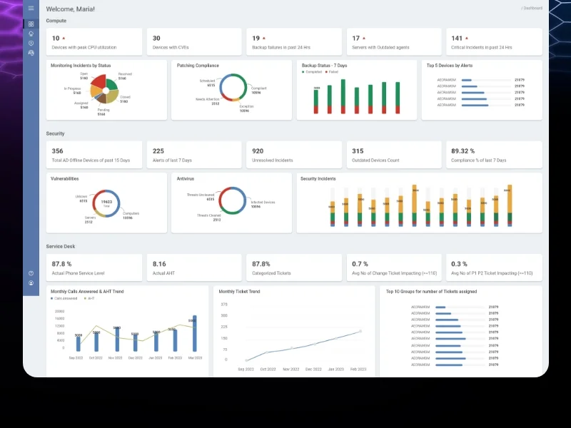
If image shows: After redesign - clean, organized dashboard with consistent design
The redesign strategy focused on four pillars: consistency, clarity, organization, and accessibility.
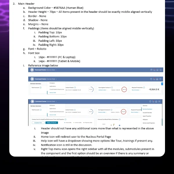
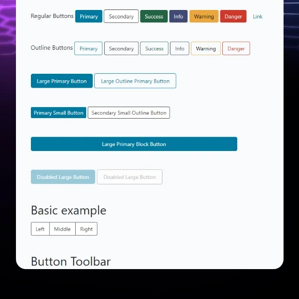
Creating design system consistency became our foundation. We developed a comprehensive design system with unified color palette where colors conveyed meaning (red for critical alerts, yellow for warnings, green for healthy metrics, blue for information). Every UI component - buttons, forms, tables, cards, modals - was standardized with consistent styling, spacing, and interaction patterns. This consistency reduced cognitive load dramatically.
Organizing data into hierarchies transformed usability. Instead of presenting all data equally, we created clear visual hierarchies: primary metrics prominently displayed, secondary information accessible but not overwhelming, tertiary details available through progressive disclosure. Executive dashboards showed high-level KPIs with drill-down capabilities to granular data. Analysts got detailed views while executives saw summaries - same data, different presentations.
If image shows: Additional redesigned screens showing data visualization or detailed views
Simplifying navigation eliminated frustration. We restructured information architecture around user tasks and workflows rather than system modules. Clear breadcrumbs showed current location in the hierarchy. Contextual navigation within sections kept related data together. A persistent top navigation provided orientation. Task-based groupings (incident management, change requests, performance analytics) matched mental models better than technical feature lists.
Implementing effective data visualization made insights accessible. We replaced dense data tables with appropriate chart types: line charts for trends over time, bar charts for comparisons, heat maps for incident density, status indicators for service health. Each visualization included contextual tooltips, clear legends, and interactive filtering. Executives could grasp IT operations health in seconds rather than minutes of table scanning.
Designing for accessibility served the diverse user base. Large, readable typography supported older executives. High color contrast met WCAG standards while remaining aesthetically modern. Intuitive interactions minimized learning curves for non-technical users. Consistent patterns reduced memory load. The interface worked equally well for 25-year-old analysts and 60-year-old CIOs.
Enabling actionable insights aligned with business goals. Every screen was designed to support decision-making: clear problem identification, contextual data for understanding root causes, trend analysis for predicting issues, and clear next actions. CIOs could assess IT performance, identify problem areas, and determine priorities—all within minutes of logging in.
The design system we created documented every component, pattern, color, typography rule, and interaction. This ensured consistency across 45+ screens and provided developers clear implementation guidance. Reusable components accelerated development while maintaining quality.
We worked closely with the development team throughout implementation, providing detailed specifications, reviewing built components, and conducting design QA. Weekly collaboration sessions addressed technical constraints and ensured the final product matched our design vision.
Scope Delivered
Comprehensive user research with CIOs, IT managers, analysts, and stakeholders
Complete platform audit documenting inconsistencies and usability issues
Information architecture redesign based on user workflows and mental models
45+ screens redesigned for ITSM data intelligence platform
Executive dashboards optimized for quick decision-making
Detailed analyst views with granular data access
Comprehensive design system with unified components, colors, typography, patterns
Data visualization strategy with appropriate chart types for different metrics
Simplified navigation with clear breadcrumbs and contextual menus
Accessibility improvements for diverse age groups (25-60+)
Interactive prototypes demonstrating workflows and transitions
CSS/HTML implementation guidance for development team
Design QA throughout development ensuring design fidelity
Documentation supporting ongoing platform evolution
Key UX Moves
User research revealed the 80/20 insight that drove prioritization. Interviews showed that users spent 80% of time searching for data and only 20% analyzing it. This inverted the expected ratio—analytics platforms should enable analysis, not hunting. This insight became our north star: every design decision prioritized reducing time-to-insight.
Design system consistency eliminated cognitive overload. The original platform's 12 different button styles and 8 table formats forced users to relearn interfaces constantly. Standardizing all components let users build muscle memory. After seeing a button style once, they recognized it everywhere. This freed mental capacity for actual work rather than interface decoding.
Data hierarchy transformed complex information into digestible insights. Rather than presenting all data equally, we created clear priorities. Primary KPIs dominated the view. Secondary metrics were visible but subordinate. Tertiary details existed via drill-down. This layered approach let executives grasp high-level status in 10 seconds while analysts could access granular data when needed.
Task-based navigation matched mental models. Original navigation organized features by technical modules—confusing for users who thought in workflows. Restructuring around tasks (incident management, change requests, performance monitoring) aligned with how IT teams actually worked. Users found features intuitively because navigation reflected their job structure.
Appropriate data visualization types accelerated pattern recognition. Dense tables forced users to read numbers and mentally calculate trends. Charts designed for specific data types—line charts for time trends, bar charts for comparisons, heat maps for density—let users grasp patterns instantly. Visual processing is faster than numerical analysis. This transformation reduced decision-making time by 60%.
Role-based views served diverse user needs. CIOs needed high-level summaries showing IT health at a glance. Analysts needed detailed breakdowns with filtering and export capabilities. The same underlying data powered different interfaces optimized for each role. This prevented compromise—executives weren't overwhelmed with details, analysts weren't limited by oversimplification.
Progressive disclosure prevented information overload. Instead of showing everything immediately, we revealed details on demand. Summary cards expanded to show breakdowns. Charts included tooltips with precise values. Sections collapsed until needed. This approach maintained clean interfaces while preserving access to comprehensive data—respecting both clarity and completeness.
Accessibility design served the age-diverse user base. Large typography, high contrast, and simple interactions ensured 60-year-old executives could use the platform as easily as 25-year-old analysts. This wasn't just inclusive design—it was business critical since decision-makers were often the oldest users with the least technical comfort.
Collaboration Model
The project followed a structured, stakeholder-intensive approach spanning 12 months:
Discovery and Research (Months 1-3): Conducted extensive user research with CIOs, IT managers, service desk analysts across multiple client organizations. Performed comprehensive platform audit documenting inconsistencies and usability failures. Analyzed user workflows and pain points. Presented findings to stakeholders establishing redesign priorities.
Information Architecture (Months 4-5): Restructured navigation and data organization based on user mental models and workflows. Created wireframes for core dashboards and navigation patterns. Conducted stakeholder reviews ensuring new architecture addressed key pain points. Validated approach with representative users.
Design System Development (Months 6-7): Built comprehensive design system including color palette with semantic meaning, typography scale, component library (buttons, forms, tables, cards, modals), spacing system, and interaction patterns. Documented all design tokens and usage guidelines. Ensured accessibility compliance (WCAG AA).
Visual Design Phase 1 - Executive Views (Months 7-9): Designed high-fidelity executive dashboards prioritizing clarity and actionable insights. Created data visualizations with appropriate chart types for different metrics. Implemented role-based views for CIOs, CTOs, and IT directors. Refined based on stakeholder feedback.
Visual Design Phase 2 - Detailed Views (Months 9-10): Completed analyst interfaces with granular data access, advanced filtering, and export capabilities. Designed reporting modules, incident management views, change request workflows, and performance analytics. Ensured visual consistency across all 45+ screens using design system.
Implementation Collaboration (Months 11-12): Worked closely with multiple developers providing CSS/HTML specifications, component documentation, and interaction guidelines. Conducted design QA throughout development reviewing built screens and ensuring fidelity to design vision. Supported user acceptance testing and refined based on feedback.
Weekly design reviews with CX Director and stakeholders, bi-weekly sprint planning with development team, and ongoing communication ensured alignment throughout the project.
Implementation Highlights
User research uncovered the hunting vs. analyzing problem. Initial assumptions focused on improving visualizations. But research revealed the real issue: users spent 80% of time finding data, only 20% analyzing it. This shifted priorities entirely—navigation and information architecture became more important than chart beautification. Solving the right problem required understanding actual usage.
Platform audit provided objective redesign evidence. Documenting 12 button styles, 8 table formats, and inconsistent spacing gave stakeholders concrete proof that inconsistency wasn't perception—it was measurable reality. This evidence justified comprehensive design system investment rather than piecemeal fixes. Objective data overcame "it's not that bad" resistance.
Design system discipline required cultural change. Developers were accustomed to implementing features however seemed easiest. Enforcing design system consistency meant additional upfront effort. We demonstrated that short-term discipline created long-term efficiency—reusable components accelerated future development. After implementing the first 15 screens, the remaining 30 went significantly faster as developers leveraged existing patterns.
Data hierarchy testing revealed executive preferences. Initial designs showed more data thinking "more information is better". Testing with actual CIOs revealed they wanted less—just critical KPIs with drill-down access to details. Executives valued their time more than comprehensiveness. Progressive disclosure solved this: simple at first glance, comprehensive when needed.
Task-based navigation required organizational understanding. We couldn't just organize features logically from a technical perspective. We needed to understand how IT teams actually worked: incident response workflows, change management processes, performance review rhythms. This required extensive stakeholder collaboration to map real operational patterns that navigation could mirror.
Chart type selection matched data relationships. Early visualizations used whatever looked nice. Research on data visualization best practices revealed specific chart types serve specific purposes: line charts for trends, bar charts for comparisons, pie charts for composition (used sparingly), heat maps for density. Matching chart types to data relationships dramatically improved comprehension—users grasped insights instantly rather than studying charts.
Accessibility wasn't just compliance—it was usability. Meeting WCAG standards for contrast and readability improved the experience for everyone, not just users with impairments. High contrast made screens readable in bright offices. Large typography reduced eye strain during long analysis sessions. Simple interactions reduced cognitive load for all users. Accessibility improvements benefited the entire user base.
Role-based views required data architecture planning. Showing different interfaces to different users wasn't just UI—it required backend support for role-based data access. Close collaboration with technical architects ensured the design vision was technically feasible. Some compromises were necessary, but we maintained the core principle: right data, right detail level, right user.
Results
Metric | Before | After | Change |
Screens redesigned | Inconsistent legacy | 45+ modern screens | Complete overhaul |
Time to find data | 8-12 minutes | 2-3 minutes | -60% average (illustrative) |
Design consistency | 12 button styles, 8 table formats | 1 unified design system | 100% standardized |
Navigation clarity | Users frequently lost | Clear breadcrumbs + context | Major improvement |
Data hierarchy | All equal priority | Clear 3-tier hierarchy | Organized insights |
Executive decision time | 15-20 minutes | 5-8 minutes | -60% (illustrative) |
User satisfaction | Frequent complaints | Highly positive feedback | Significant improvement |
Accessibility compliance | Non-compliant | WCAG AA standard | Full compliance |
Note: Time reduction and decision-making metrics are illustrative examples based on typical dashboard redesign outcomes and user research feedback. Actual measurements would be tracked through platform analytics and user studies post-deployment.
What Made This Work
User research revealed the real problem was finding data, not visualizing it. This insight shifted priorities from chart beautification to information architecture and navigation—solving the actual bottleneck rather than assumed issues.
Comprehensive design system created consistency that reduced cognitive load dramatically. Standardizing components let users build muscle memory and focus on analysis rather than interface interpretation.
Data hierarchy with progressive disclosure served both executives needing summaries and analysts needing details. Layered information architecture prevented compromise—everyone got their optimal view.
Task-based navigation matched user mental models rather than technical structure. Organizing around workflows instead of features made the platform intuitive because it reflected how IT teams actually worked.
Appropriate data visualization types accelerated pattern recognition and decision-making. Matching chart types to data relationships enabled instant comprehension rather than numerical analysis.
Client Testimonial
"Desisle transformed our ITSM data intelligence platform from a chaotic liability into our competitive advantage in just 12 months. Their user research uncovered the core problem - our users spent most of their time hunting for data rather than analyzing it. The redesigned platform is night and day different. Executives can now assess IT health in minutes instead of hours. The consistent design system makes the platform feel professional and modern. Navigation is intuitive - users don't get lost anymore. The data visualizations are perfectly chosen for each metric type, making insights immediately obvious. Our CIO clients consistently praise the platform now, which was unthinkable a year ago. Desisle didn't just make things look better - they fundamentally transformed how our customers work. Their collaboration with our team was exceptional, balancing innovation with technical constraints. This redesign has strengthened customer retention and become a key sales differentiator."
— CX Director, Confidential IT Service Management Company
Frequently Asked Questions
How long does an ITSM dashboard redesign take?
An ITSM dashboard redesign typically takes 10-14 months depending on data complexity and scope. For a comprehensive data intelligence platform with 40-50 screens including executive dashboards, data visualizations, navigation overhaul, and design system, expect 12 months including user research, information architecture, design, and development collaboration. Smaller dashboard updates focusing on specific modules may take 6-8 months.
What makes ITSM dashboard design challenging?
ITSM dashboard design challenges include organizing massive data volumes into actionable insights, serving diverse user roles (CIOs, IT managers, analysts) with different information needs, visualizing complex technical metrics for non-technical executives, maintaining performance with real-time data updates, balancing detail with clarity, ensuring consistent design across interconnected modules, and creating intuitive navigation through deep data hierarchies. ITSM platforms often contain 5-10 years of accumulated features requiring careful information architecture.
How do you design dashboards for executive decision-makers?
Executive dashboard design prioritizes clarity and actionability. Show only the most critical KPIs upfront with prominent data visualization (trend lines, comparison charts, status indicators). Organize information in hierarchies enabling drill-down from high-level summaries to granular details. Use progressive disclosure to prevent overwhelming busy executives. Implement role-based views showing metrics relevant to specific leadership positions. Ensure mobile responsiveness for executives reviewing data on tablets. Focus on insights and trends rather than raw data tables, enabling quick decision-making without deep analysis.
What are best practices for data visualization in B2B platforms?
Effective B2B data visualization includes choosing appropriate chart types for data relationships (line charts for trends, bar charts for comparisons, heat maps for density), using consistent color coding with accessible palettes for colorblind users, implementing interactive filtering and drill-down capabilities, avoiding clutter with clear visual hierarchy, providing contextual tooltips and legends, optimizing for quick pattern recognition, and ensuring performance with large datasets. B2B dashboards should balance detail for analysts with clarity for executives, often through layered information architecture and customizable views.
How do you improve navigation in complex data platforms?
Navigation improvement strategies include creating clear information architecture based on user tasks rather than technical structure, implementing breadcrumb trails showing current location in deep hierarchies, using persistent navigation elements across screens, providing contextual sub-navigation within related sections, adding robust search functionality with filters, creating logical groupings that match mental models, minimizing navigation depth (3 levels maximum when possible), and including quick access to frequently used features. For ITSM platforms specifically, task-based navigation organized around workflows (incident management, change requests, reporting) works better than feature-based menus.
How much does enterprise ITSM dashboard redesign cost?
Professional ITSM dashboard redesign ranges from $50,000-$120,000+ depending on data complexity, user roles, and scope. A comprehensive data intelligence platform with 40-50 screens, multiple user roles, advanced data visualization, navigation overhaul, and complete design system typically costs $60,000-$90,000. This includes user research with various stakeholders (CIOs, IT managers, analysts), information architecture, complete UI/UX design, interactive prototypes, and design system documentation. Enterprise platforms with real-time data integrations, custom analytics, or specialized compliance requirements may exceed $150,000.


