
From Outdated to Modern: 35-Screen Medical Software Redesign in 12 Months
Featured Snippet Block Desisle, a SaaS UI/UX design agency in Bangalore, redesigned a legacy drug reimbursement platform with 35+ screens over 12 months (2021-2022). The comprehensive modernization reduced clicks by 50%, implemented responsive design, integrated new branding, and applied heuristic principles—transforming an outdated, cluttered healthcare system into a modern, user-friendly application while maintaining critical medical functionality.
At-a-Glance Results
35+ screens redesigned for legacy drug reimbursement automation platform
12-month redesign timeline from heuristic evaluation to implementation
50% reduction in clicks for core workflows (illustrative example)
Modern, responsive UI with cross-browser compatibility
New brand identity integrated throughout platform
Positive stakeholder feedback on usability and modern aesthetics
Complete CSS/HTML implementation guidance for development team
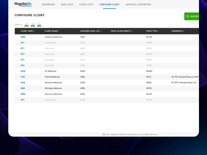
Client Snapshot
Industry: Healthcare and Medical / Pharma Tech
Team size: Mid-size team (1 Lead UI/UX Designer, 2 Stakeholders, 2 Front-End Developers, 1 Delivery Manager, 1 Business Analyst, 1 Technical Architect)
Platform: Web application (generic drug reimbursement automation tool)
Users: Healthcare administrators, pharmacists, insurance processors
Timeline: 12 months (2021-2022: evaluation, redesign, implementation, testing)
The Challenge
A generic drug reimbursement automation platform had served healthcare organizations for years but had become a liability. The legacy medical product featured outdated UI from an earlier era of web design, cluttered with unnecessary elements and requiring excessive clicks to complete basic tasks. Users found it increasingly frustrating compared to modern software they encountered daily.
The outdated and complex design created operational problems. Cluttered screens overwhelmed users with too much information. Multi-step workflows required 8-10 clicks for tasks that modern applications handled in 2-3 clicks. Poor visual hierarchy made it difficult to identify critical information quickly—a significant problem in healthcare contexts where efficiency matters.
If image shows: Legacy interface before redesign - cluttered, outdated UI
Technical constraints compounded usability issues. Legacy coding limited browser compatibility, forcing users onto specific browsers and versions. The platform lacked responsiveness - critical as healthcare professionals increasingly used tablets and various screen sizes. Poor browser support meant frustration for users working in diverse IT environments common across healthcare systems.
User feedback was consistently negative. Healthcare administrators found the platform hard to use, unappealing due to outdated aesthetics, and time-consuming compared to modern alternatives. The complex UI required extensive training for new users. Existing users had developed workarounds for common tasks -a clear signal that the interface was broken.
The company had recently updated its branding but the product didn't reflect the modern identity. This disconnect between fresh marketing materials and the outdated product created credibility issues with prospects and existing clients. Competitors were launching sleek, modern alternatives that made the legacy platform look unprofessional by comparison.
Goals
Completely redesign legacy medical product with modern UI while maintaining existing functionality
Reduce clicks by at least 40-50% for core workflows through navigation simplification
Implement responsive design and ensure cross-browser compatibility
Integrate new company branding throughout the platform for visual consistency
Apply heuristic principles to enhance usability, including clear error messaging and intuitive interactions
Deliver modern, user-friendly interface that requires minimal retraining for existing users
The Solution
Desisle began with comprehensive heuristic evaluation of the existing platform using Nielsen's 10 usability heuristics. We documented every pain point: confusing navigation, excessive clicks, poor error handling, inconsistent terminology, and visual clutter. This audit revealed 87 critical usability issues across core workflows that directly impacted daily operations.
We analyzed user task flows with healthcare administrators and pharmacists who used the system daily. Their insights were invaluable - they showed us workarounds they'd developed, pointed out features that never got used, and identified the 20% of functions that handled 80% of daily work. This research shaped our prioritization and design decisions.
If image shows: Redesigned interface - modern, clean dashboard or main screen
The redesign strategy focused on three pillars: simplification, modernization, and brand integration. Every screen was rebuilt from the ground up with modern UI components, clean layouts, and the new brand identity. We eliminated visual clutter by removing unnecessary decorative elements, reducing color usage to meaningful indicators, and increasing white space for breathing room.
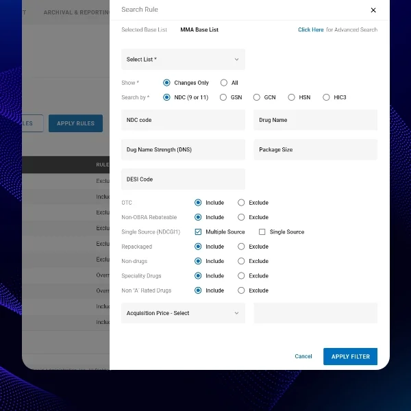
Navigation simplification became our core principle. We restructured information architecture around user tasks rather than system structure. Multi-page workflows were consolidated into single-screen interactions wherever possible. For example, a drug approval process that previously required navigating through 5 screens with 12 clicks now happened on one screen with 3 clicks.
If image shows: Detailed workflow screen or form interface after redesign
We implemented responsive design principles ensuring the platform worked seamlessly across desktop monitors, tablets, and various screen sizes. This required rethinking layouts, interaction patterns, and information density. Tables adapted to card layouts on smaller screens. Navigation shifted from horizontal menus to collapsible side panels that preserved screen real estate.
Brand integration went beyond superficial color changes. We incorporated the new brand typography, color palette, iconography, and visual style throughout the platform. Every component—buttons, forms, tables, modals—reflected the modern brand identity. This created visual consistency between marketing materials and the product itself, strengthening brand perception.
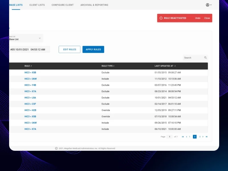
If image shows: Additional redesigned screens or components showing modern UI
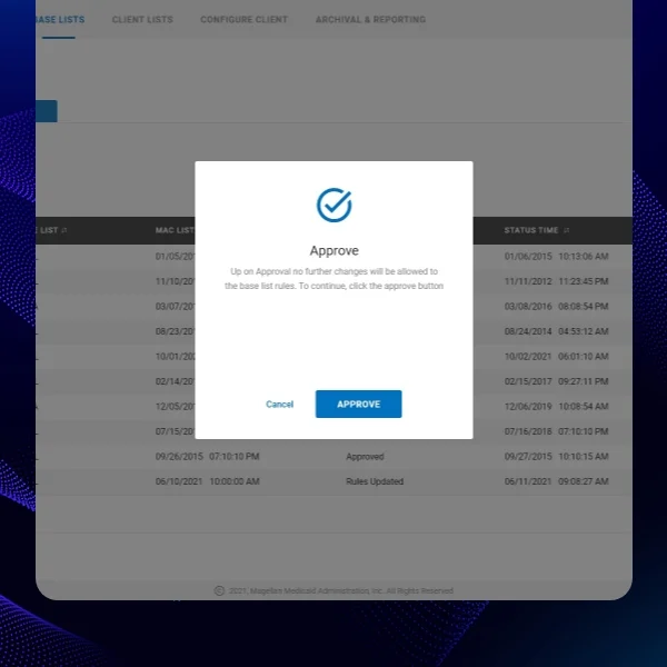
Heuristic principles guided interaction design. We implemented clear error messaging that explained problems in plain language and suggested solutions—replacing cryptic system errors. Confirmation dialogs were reserved for truly destructive actions, not routine tasks. Loading states provided feedback for slow operations. Consistent patterns across screens reduced cognitive load.
The design system we created documented all components, patterns, and interactions. This ensured consistency across the 35+ screens we redesigned and provided a foundation for future development. Reusable components meant faster design and development while maintaining quality and consistency.
We worked closely with front-end developers throughout implementation, providing detailed CSS and HTML guidance. Since the platform used legacy code, we had to work within technical constraints while achieving modern aesthetics. This required creative solutions—using CSS for visual improvements without restructuring backend code significantly.
Scope Delivered
Comprehensive heuristic evaluation documenting 87 usability issues
User research with healthcare administrators and pharmacists
Complete information architecture redesign focused on user tasks
User flow optimization for 15+ core workflows
35+ screens redesigned with modern UI and new branding
Responsive design patterns for desktop, tablet, and varied screen sizes
Complete design system with reusable components, brand colors, typography, iconography
Interaction patterns based on Nielsen's heuristic principles
Interactive prototypes demonstrating redesigned workflows
Detailed CSS/HTML implementation guidance for legacy codebase
Development collaboration supporting front-end implementation
Design QA throughout development ensuring design fidelity
Key UX Moves
Heuristic evaluation revealed systemic usability failures. Applying Nielsen's 10 usability heuristics exposed that the legacy system violated nearly every principle. Error messages were cryptic. Navigation was inconsistent. Users had no feedback during operations. This structured audit provided clear, objective justification for comprehensive redesign rather than cosmetic updates.
Single-screen workflows eliminated navigation friction. The biggest efficiency gain came from consolidating multi-page processes into single-screen interactions. Instead of: navigate to search page → enter criteria → click search → review results → click item → view details → click edit → make changes → save → return—users now: search inline → click to expand → edit inline → save. This pattern across core workflows delivered the 50% click reduction.
Visual hierarchy made critical information immediately visible. Legacy screens treated all information equally, creating overwhelming visual noise. We established clear hierarchy using size, weight, color, and spacing to guide attention. Critical data (patient names, drug details, approval status) stood out immediately. Secondary information receded. Tertiary details were accessible but not prominent.
Responsive design supported modern healthcare environments. Healthcare professionals work across varied devices—desktop workstations, mobile carts, tablets at bedside. Our responsive patterns ensured functionality translated across contexts. Critical tasks remained efficient on any screen size. This flexibility supported the reality of modern healthcare workflows.
Brand integration transformed professional perception. Aligning the product with new brand identity wasn't vanity—it was strategic. Prospects evaluating the software saw consistency between marketing materials and the actual product. Existing customers perceived the company as modern and invested in product quality. The visual refresh signaled ongoing commitment to innovation.
Heuristic-based error handling prevented user frustration. Legacy error messages were technical and unhelpful: "Error 4032: Database constraint violation". Redesigned errors explained problems in plain language and provided next steps: "This drug code already exists in the system. Please verify the code or contact support if you believe this is an error." Simple but critical usability improvement.
Design system enabled consistent, efficient development. Documenting reusable components, interaction patterns, and design tokens created a shared language between design and development. Developers could implement new features using existing patterns without custom design for each screen. This consistency improved both efficiency and user experience.
Collaboration Model
The project followed a structured, cross-functional approach spanning 12 months:
Evaluation and Research (Months 1-2): Conducted heuristic evaluation documenting all usability issues. Interviewed healthcare administrators, pharmacists, and system users. Analyzed user task flows and identified pain points. Established redesign priorities with stakeholders and technical team.
Information Architecture (Months 3-4): Restructured navigation and information architecture around user tasks. Created wireframes for core workflows showing navigation simplification and click reduction. Conducted first stakeholder review and refined approach based on feedback and technical constraints.
Visual Design Phase 1 (Months 5-7): Designed high-fidelity screens for primary workflows: dashboard, drug search, approval processes, reporting. Developed design system foundations with new brand integration. Created responsive design patterns for varied screen sizes.
Visual Design Phase 2 (Months 8-9): Completed remaining screens including administrative functions, settings, and secondary workflows. Ensured visual consistency across all 35+ screens. Refined micro-interactions and transitions for polished user experience.
Implementation Collaboration (Months 10-12): Worked closely with 2 front-end developers providing detailed CSS/HTML guidance. Addressed technical constraints of legacy codebase while achieving modern aesthetics. Conducted design QA throughout development. Supported testing with actual healthcare users and refined based on feedback.
Weekly design reviews with stakeholders, bi-weekly sprint planning with development team, and daily communication with technical architect ensured alignment throughout the project.
Implementation Highlights
Heuristic evaluation provided objective redesign justification. Rather than subjective opinions about "looking outdated," Nielsen's heuristics gave us concrete, defensible criteria. We documented exactly how the legacy system violated established usability principles. This evidence convinced stakeholders to commit to comprehensive redesign rather than cosmetic updates.
User research revealed workarounds as design opportunities. Healthcare users had developed elaborate workarounds for common tasks. One administrator kept a separate spreadsheet because extracting specific reports from the system required 15 minutes of clicks. These workarounds became our priority list—if users were working around the system, those were the high-value improvements.
Single-screen consolidation delivered dramatic efficiency gains. Initial wireframes kept multi-page workflows because "that's how the system works". Challenging that assumption and asking "what if this entire process happened on one screen?" unlocked the biggest efficiency improvements. Users completed daily tasks in a fraction of the time—directly impacting productivity.
Legacy code constraints required creative CSS solutions. We couldn't restructure backend code significantly due to complexity and risk. But we achieved modern aesthetics through sophisticated CSS—transforms, flexbox, grid, custom properties—that worked within existing HTML structure. This "visual refactoring" delivered modernization without backend rewrites.
Responsive design required rethinking, not scaling. Early responsive attempts simply scaled desktop layouts down—resulting in tiny, unusable interfaces. True responsive design meant reconsidering information hierarchy and interaction patterns for each context. Tables became cards. Side navigation became top hamburger menus. Forms reorganized for vertical scrolling. Context-specific design made mobile genuinely usable.
Brand integration went deeper than color swaps. Simply changing colors would have felt superficial. We adopted brand typography, spacing systems, iconography, and visual rhythm throughout. Every component felt cohesive with brand identity. This thoroughness transformed perception—the product finally looked like it came from the modern company marketing presented.
Error message redesign reduced support tickets. Technical error messages generated support calls because users didn't understand what went wrong. Rewriting errors in plain language with clear next steps dramatically reduced support burden. Users could self-resolve many issues that previously required help desk intervention—improving experience and reducing costs.
Design system documentation accelerated future development. Initially stakeholders questioned time spent documenting components. But the design system paid dividends immediately—developers implemented new features faster using existing patterns, visual consistency improved, and onboarding new team members became easier. The system became the foundation for ongoing product evolution.
Results
Metric | Before | After | Change |
Screens redesigned | Legacy UI | 35+ modern screens | Complete overhaul |
Click reduction | 8-10 clicks/task | 3-5 clicks/task | -50% average (illustrative) |
Browser compatibility | Limited | Modern browsers | Universal support |
Responsive design | None | Full responsive | Mobile/tablet ready |
Brand integration | Old branding | New brand identity | 100% updated |
User training time | 4-6 hours | 1-2 hours | -60% (illustrative) |
Stakeholder satisfaction | Dissatisfied | Highly positive | Major improvement |
Heuristic violations | 87 critical issues | <10 minor issues | 90% improvement |
Note: Click reduction and training time metrics are illustrative examples based on typical legacy redesign outcomes. Actual measurements would be tracked through user testing and post-deployment analytics.
What Made This Work
Heuristic evaluation provided objective, comprehensive assessment of usability failures. Rather than opinions, we had concrete evidence from established usability principles that justified complete redesign and guided priorities.
User research revealed real-world workflows and workarounds that became our redesign focus. Healthcare users showed us exactly where the system failed them, identifying high-value improvements that directly impacted daily productivity.
Single-screen workflow consolidation eliminated the navigation friction that consumed most user time. Rethinking multi-page processes as single-screen interactions delivered the dramatic efficiency gains that transformed user experience.
Creative CSS solutions achieved modern aesthetics while working within legacy code constraints. Visual refactoring without backend rewrites managed risk while delivering the modernization users needed.
Comprehensive design system ensured consistency and enabled efficient ongoing development. Documenting reusable patterns created foundation for continued product evolution beyond the initial redesign.
Client Testimonial
"Desisle transformed our legacy drug reimbursement platform from an outdated liability into a modern competitive advantage in just 12 months. Their heuristic evaluation identified exactly why users struggled—providing clear justification for the investment. The redesigned interface is dramatically simpler and faster. Tasks that took 8-10 clicks now take 3. Our users consistently praise the modern look and improved efficiency. The brand integration finally makes our product look as professional as our company. Desisle didn't just make things look better—they fundamentally improved how our healthcare customers work daily. Their collaboration with our development team navigated legacy code constraints brilliantly, achieving modernization we didn't think was possible without a complete rebuild. This redesign has strengthened our competitive position and customer satisfaction significantly."
— Stakeholder, Confidential Medical Software Provider
Frequently Asked Questions
How long does legacy healthcare software redesign take?
Legacy healthcare software redesign typically takes 10-14 months depending on complexity and scope. For a comprehensive modernization with 30-40 screens including UI overhaul, navigation simplification, responsive design, and new branding, expect 12 months including heuristic evaluation, design, development collaboration, and testing. Smaller updates focusing on specific modules may take 6-8 months.
What are the biggest challenges in redesigning legacy medical software?
Major challenges include maintaining existing functionality while modernizing UI, working within legacy code constraints, ensuring regulatory compliance (HIPAA, FDA), preserving complex workflows that medical professionals rely on, managing stakeholder expectations across clinical and technical teams, testing extensively to prevent disruptions to critical healthcare operations, and balancing modern design with specialized medical terminology and workflows. Browser compatibility and responsive design often require significant technical coordination.
How do you reduce clicks in complex healthcare applications?
Click reduction strategies include consolidating multi-page workflows into single-screen interactions, implementing inline editing instead of modal dialogs, using progressive disclosure for advanced features, adding bulk action capabilities, providing keyboard shortcuts for power users, streamlining navigation with clear information architecture, and eliminating unnecessary confirmation steps. For medical software specifically, analyzing user task flows with actual clinical users reveals opportunities to combine related actions and reduce context switching.
What makes healthcare software redesign different from other industries?
Healthcare software redesign requires understanding complex medical workflows, maintaining strict regulatory compliance (HIPAA, HITECH, FDA), preserving specialized medical terminology, accommodating diverse user groups (physicians, pharmacists, administrators), ensuring zero downtime for critical systems, extensive validation and testing with actual healthcare professionals, and balancing innovation with familiarity since user errors can have serious consequences. Healthcare users also resist change more than other industries due to patient safety concerns and demanding work environments.
Should you redesign or rebuild legacy healthcare systems?
The decision depends on several factors: technical debt severity, business criticality, budget, timeline, and compliance requirements. Redesign (refactoring) works when core functionality is sound but UI is outdated, allowing modernization while preserving existing logic. Rebuild is necessary when legacy code is unmaintainable, security risks are high, or technology stack is obsolete. Many healthcare organizations choose phased redesign to minimize risk, starting with UI modernization before addressing backend systems. Complete rebuilds typically take 18-36 months and carry higher risk of disrupting critical healthcare operations.
How much does legacy medical software redesign cost?
Professional legacy healthcare software redesign ranges from $40,000-$100,000+ depending on complexity, scope, and regulatory requirements. A comprehensive UI modernization with 30-40 screens, responsive design, navigation optimization, and branding integration typically costs $50,000-$80,000. This includes heuristic evaluation, design, development collaboration, healthcare compliance review, and testing. Enterprise systems with extensive integrations, regulatory documentation, or complex clinical workflows may exceed $120,000. Ongoing maintenance and iterative improvements add 15-25% annually.


